One of the largest challenges in this project was creating a logo that felt friendly, modern, and approachable while still representing a reliable non-emergency transportation service. The design needed to resonate with a wide audience, ranging from elderly riders to younger members, while maintaining a professional tone appropriate for a health related service.
Because Quiktrip serves as a transportation system, it was essential that the logo communicated movement clearly, yet remained simple enough to be recognized instantly at various sizes. Finding the right balance between creativity and clarity required multiple iterations, especially when shaping the arrow and circular form to symbolize both motion and connection without becoming visually overwhelming.
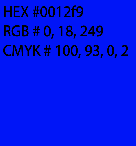
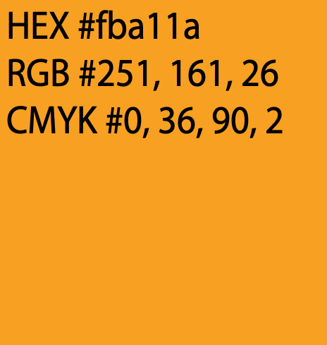
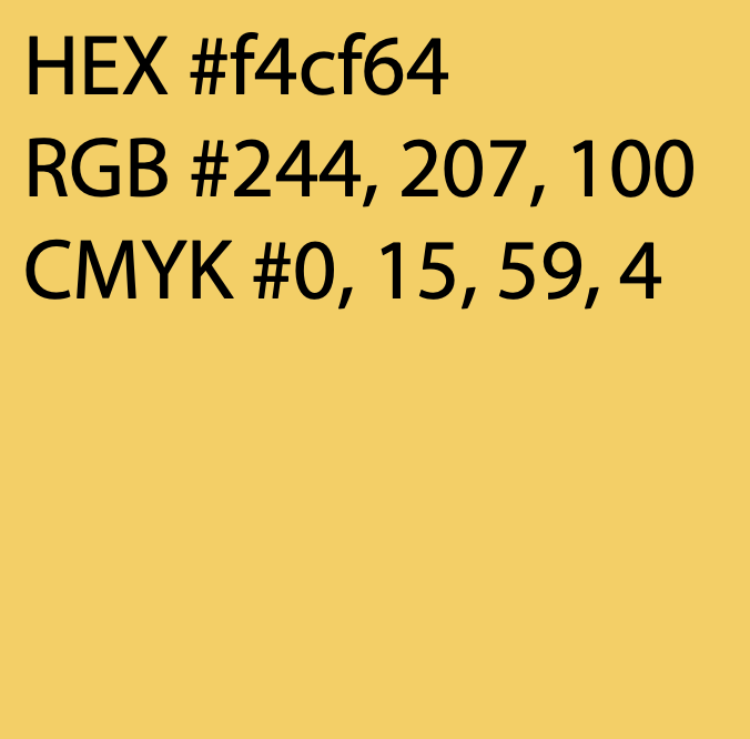
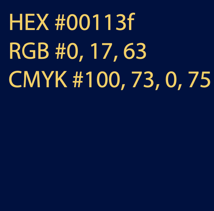
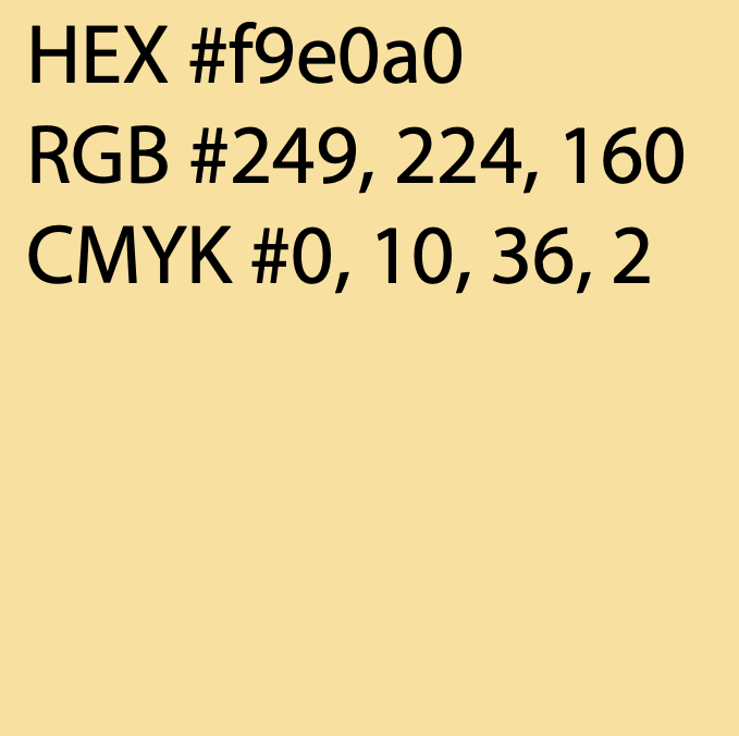
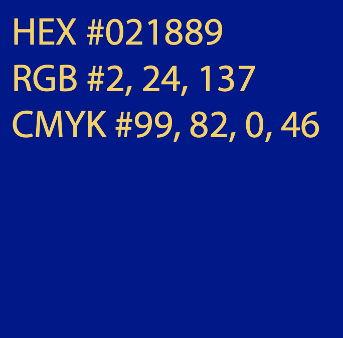
Another challenge involved color selection. The design needed to stand out on vehicles, printed materials, uniforms, and digital platforms. Ensuring high visibility while maintaining accessibility meant testing multiple color combinations for contrast, legibility, and emotional tone. The final palette, bright orange and bold blue was chosen to evoke energy, trust, and approachability.
Additionally, designing in Adobe Illustrator required careful consideration of scalability. Since the logo will be used across many formats, from small digital icons to large vehicle graphics, the shapes had to remain clean, bold, and reproducible across different production methods. This meant avoiding overly thin lines or intricate details that could be lost when printed or viewed from a distance.
Overall, the biggest challenge was merging creativity with functional clarity crafting a logo that is visually engaging, universally understandable, and easy to reproduce across a wide range of real-world applications.
Visually, the symbol needed to communicate movement and direction in a playful way without becoming overly whimsical. The looping form and arrow were designed to feel energetic and dynamic, but simplifying the shapes was essential to ensure the logo still appeared professional and easy to interpret at a glance.
Readability also played a major role in the design. The typography had to complement the icon without competing with it, and it needed to remain legible across many different applications, vehicle decals, uniforms, social media, printed brochures, and more. Testing various weights and letterforms helped ensure the type stayed clean, bold, and clear at both large and small sizes.
Color selection introduced another layer of difficulty. Bright, vibrant colors helped express the approachable, community-focused nature of the service, but they also had to maintain accessibility and contrast for clear visibility. Fine-tuning the orange and blue tones helped achieve a look that feels both energetic and credible.



Typeface
Montserrat Bold
Usage
Headlines
The final step in this process was testing how the logo would perform across the different real world applications it needed to adapt to. Because the Quiktrip logo will appear on vehicles, printed materials, uniforms, and digital platforms, it was important to understand how the shapes, colors, and typography held up in various sizes and production settings.
To evaluate this, multiple scaled mockups were created ranging from small digital icons to large vehicle decals. This testing phase revealed how certain details behaved when reduced or enlarged. At smaller sizes, some of the curves within the symbol became less defined, and the weight of the typography required slight adjustment to maintain clarity.
Management
Mark Franz
Project Manager
Nathaniel Berger
Account Manager
Creative Direction
Mark Franz
Creative Director
Caroline Murphy
Creative Director
Xenab Malik
Creative Director
Production
Briele Dudgeon
Graphic Design
Caden Marinacci
Graphic Design
QuikTrip Trasportation


