Rittenhouse Farm
Task
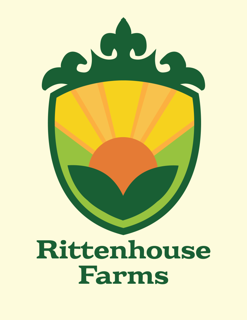
The main task was creating a vibrant logo for the client to use for the branding for their farm.

A challenge that we faced with our project was speaking what the farm stood for through the logo and making the client happy. For the most part everything was very smooth sailing and the project just slowly developed. The main issue was figuring out exactly what we were going to do. Using mood boards and collages using pre existing logos we really got a feel for what the client wanted and how we would create the design.
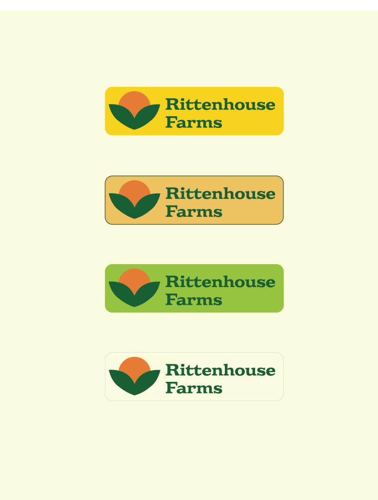
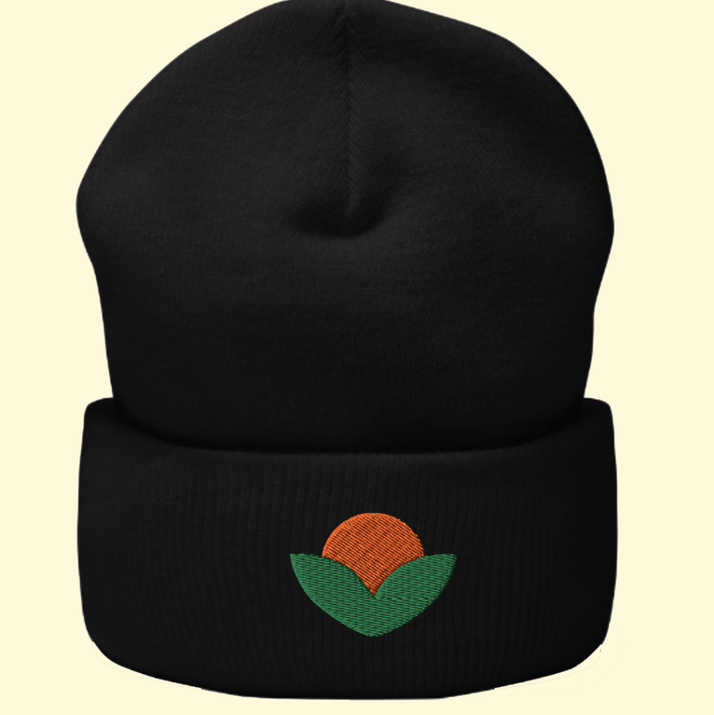
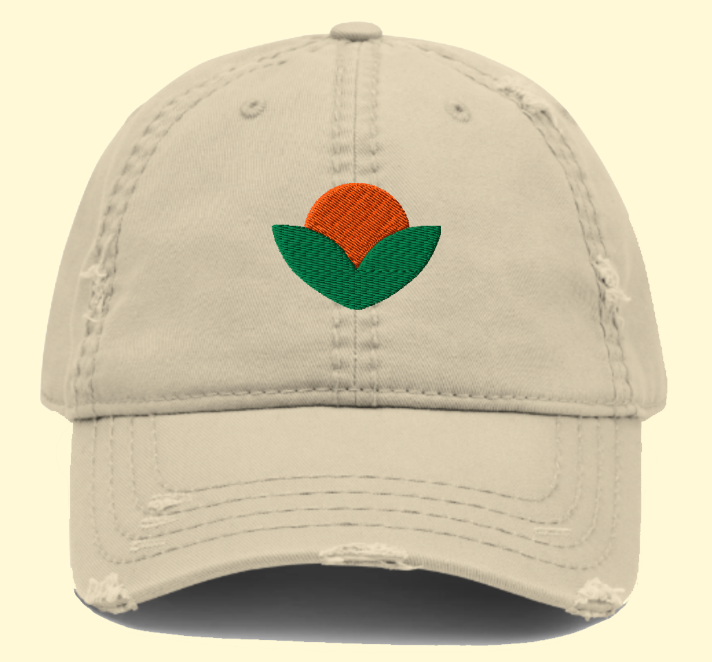
Another challenge that we had was making sure that the logo had the correct colors and how it would look if it were to be sized down. To solve these issues we simplified the logo so that even if it were resize it would still read correctly. In addition to that, we created a secondary logo so that the client could use this for even smaller items or embroidery. The color choices weren’t as difficult because really the client just wanted something that spoke ” Fresh” and ‘Vibrant”, which we achieved in the end
The main goal for the project was to create a logo for Rittenhouse Farms for barn signage, shirts, hats, and embroidery. Overall, the project went really well and the client was very happy with what we came up with.
This project was very fun and collaborative throughout the semester. The client happily gave helpful feedback and it really pushed the project to become great. Overall, everyone working on this project kept it very fun and easy going. As we refined directions for the project the client was exited to see the ending result.
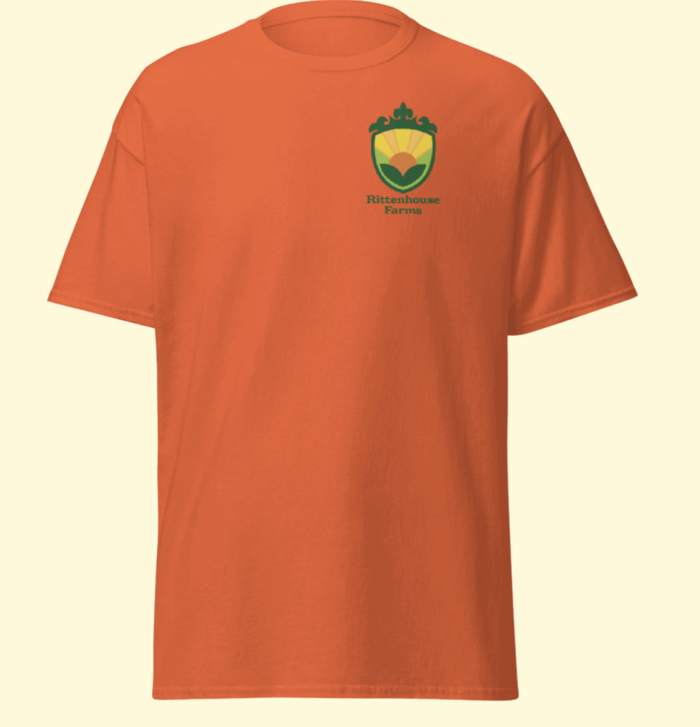
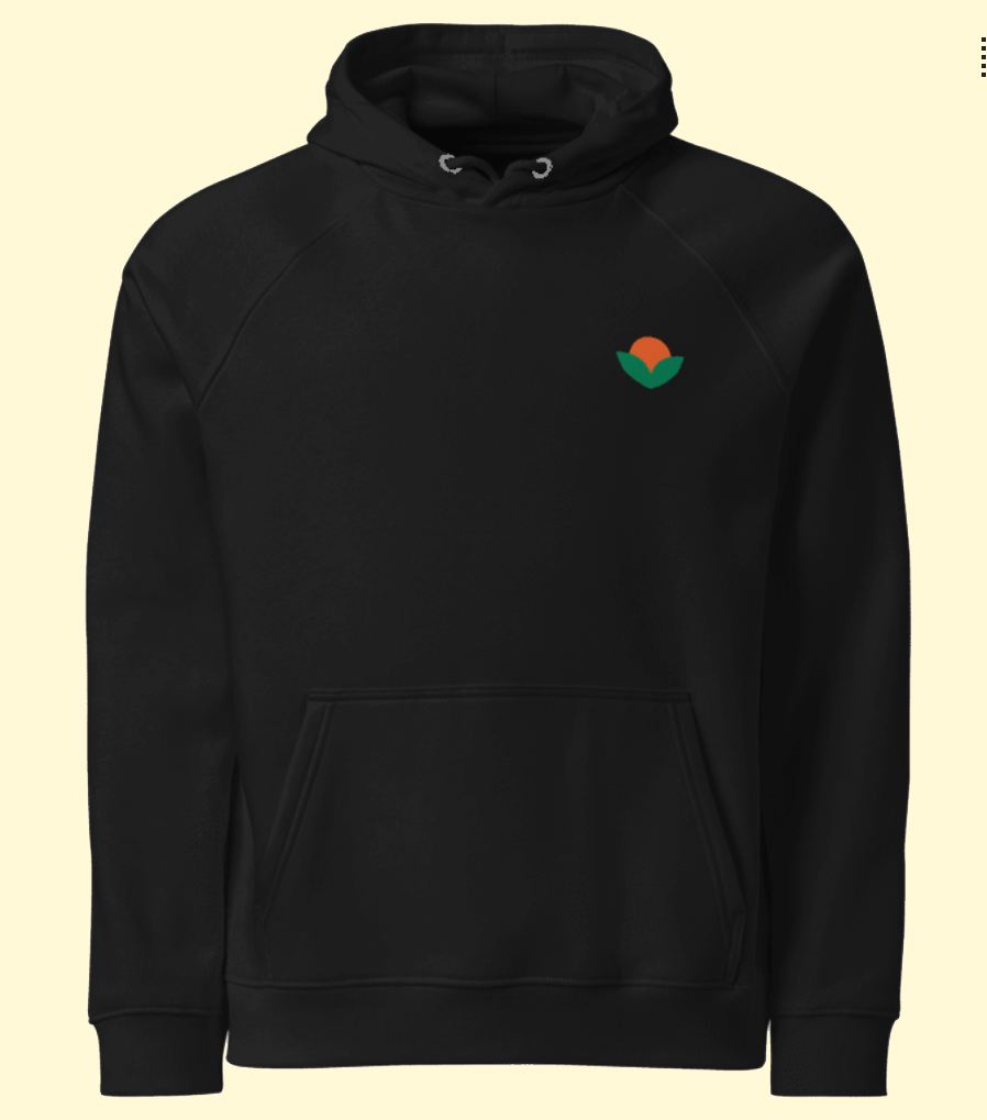
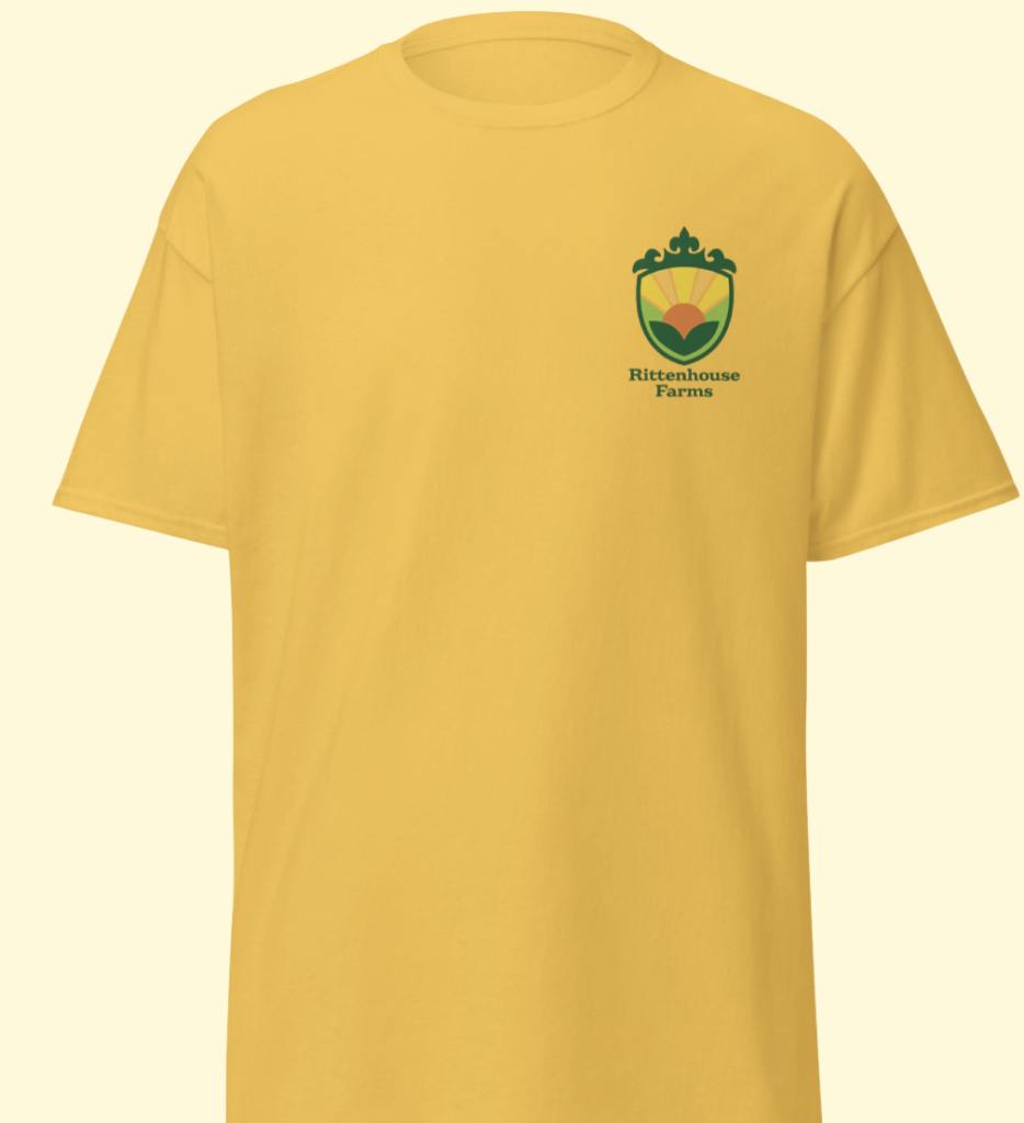
The mockups below show the primary and secondary design put into real world items. The Client really liked colorful branding but also liked black and white products.
| Green #96C23F |
$color-Light green |
◯ |
| R 150 G 194 B 63 |
| Medium Orange #FBB042 |
$Medium Orange |
◯ |
| R 251 G 176 B 66 |
| Green #1A5F32 |
$color-Dark green |
◯ |
| R 26 G 95 B 50 |
| Yellow #F8D222 |
$color-Yellow |
◯ |
| R 248 G 210 B 34 |
| Orange #E57935 |
$color-Dark orange |
◯ |
| R 229 G 121 B 53 |
| Light Orange #F7C24E |
$color-Light Orange |
◯ |
| R 247 G 194 B 78 |
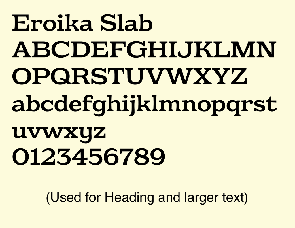
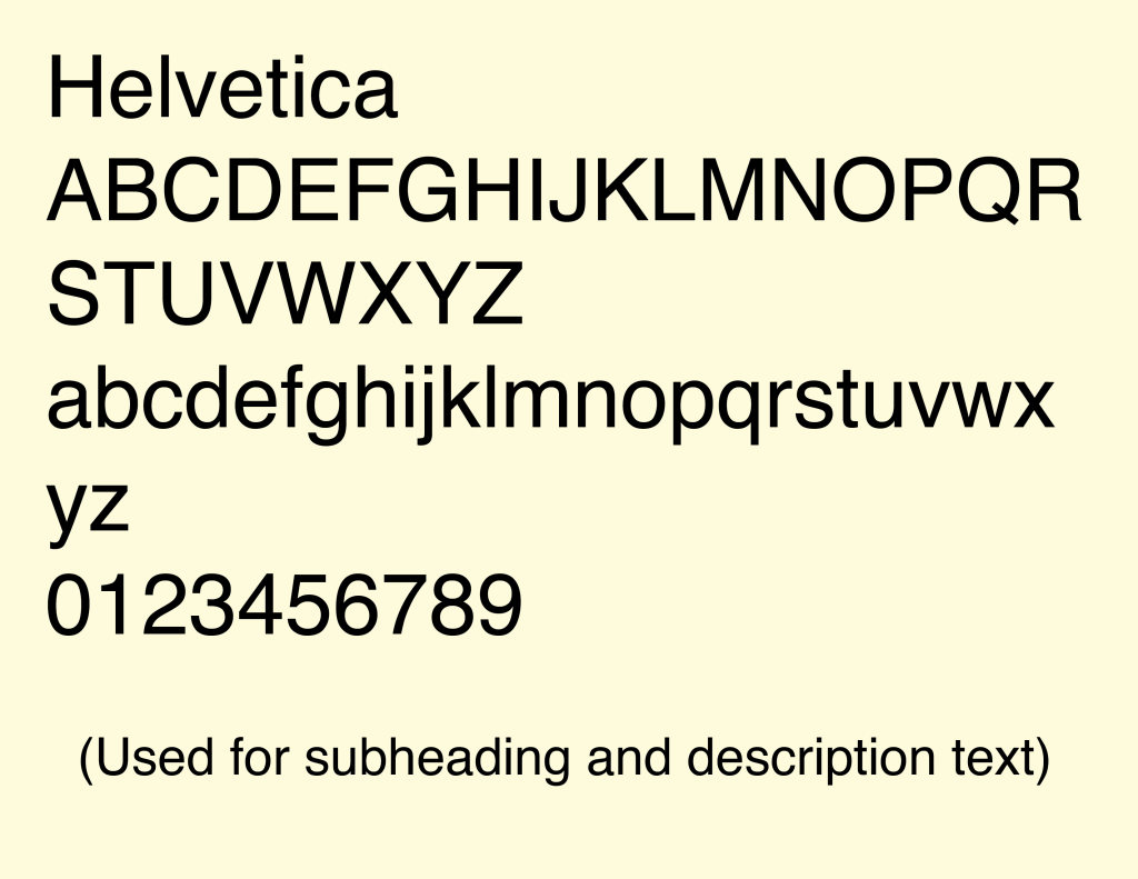
The final phase of this project was to create mockups for the client to see how or what they could use their new logo for. For example when to use the secondary or primary logo also, showing how embroidery looks versus the regular print on a shirt or hat.(Which is shown below).
Management
Mark Franz
Project Manager
Nathaniel Berger
Account Manager
Creative Direction
Mark Franz
Creative Director
Caroline Murphy
Creative Director
Xenab Malik
Creative Director
Production
Kelly Shaver
Graphic Design
Nevada Fish
Graphic Design


