Hex
#EFD057
RGB
239, 208, 87
CMYK
0, 13, 64, 6
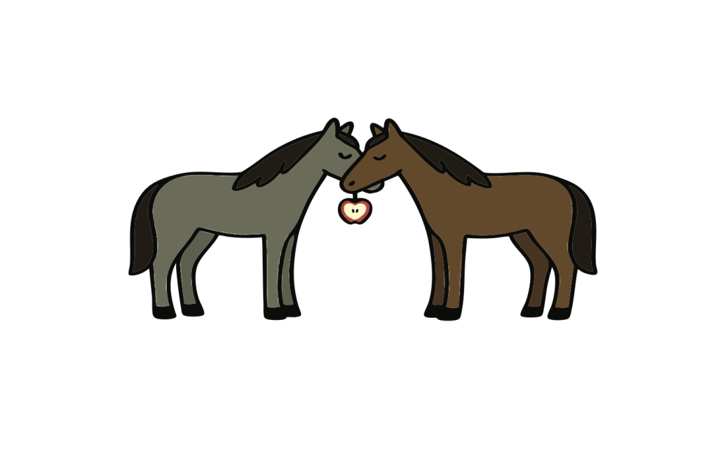
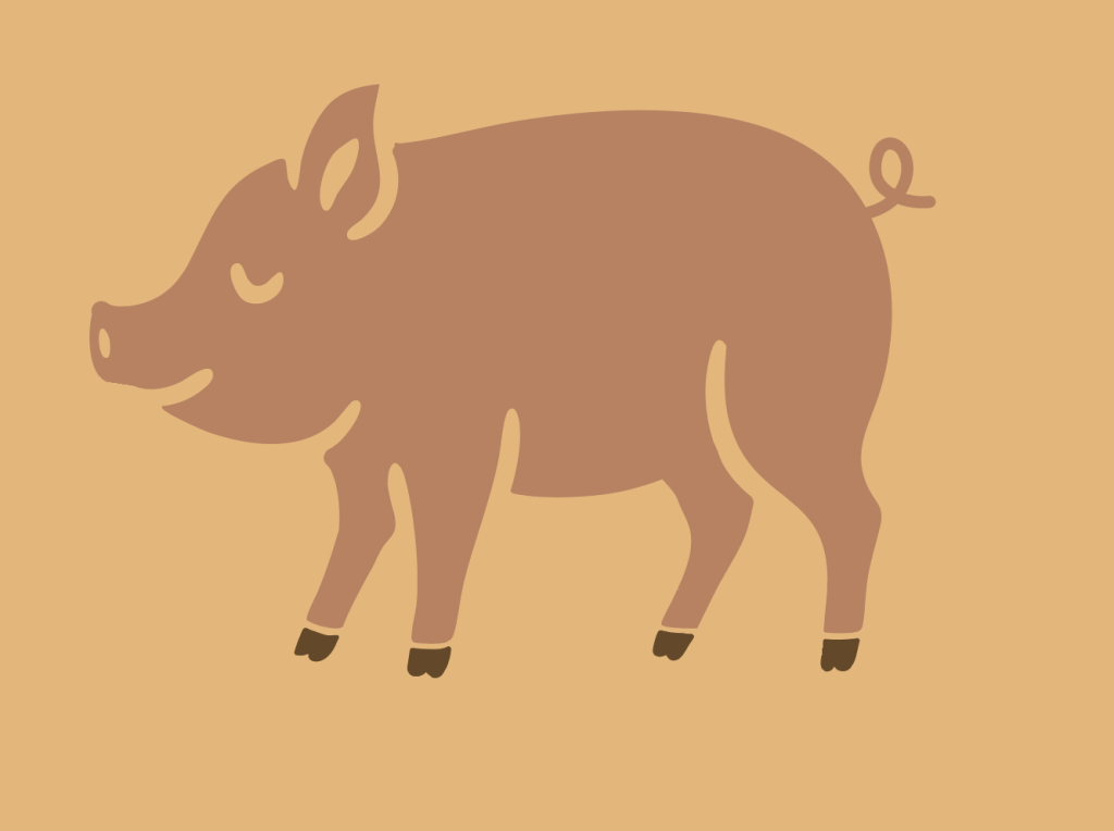
We as designers were tasked with making an entry sign for Phoenix Farm, as well as another secondary design to use on various merchandise items.

One of the biggest challenges in this design process was finding the balance between clear communication and visual restraint. With so much freedom in terms of imagery and symbolic elements, it became easy to over design. Our goal was to include every component that contributed meaningfully to the design without overwhelming the viewer. Through careful organization and intentional use of hierarchy, we were able to incorporate all the necessary elements while still maintaining a clean, effective composition.
Another significant challenge was consistently maintaining the “Appalachian Folk” art style across all visual assets. Achieving this required extensive trial, error, and multiple rounds of iteration. Each adjustment helped refine the overall design until everything felt unified. Through this process, we were ultimately able to deliver a cohesive and successful final design that authentically reflects the aesthetic we aimed to capture.
Additionally, when working with so many visual elements, we had to be especially mindful of how the design would scale. A composition that feels balanced at full size can quickly become overcrowded or lose clarity when reduced. Ensuring that every element maintained its readability and purpose across different sizes added another layer of complexity to the process, but it ultimately strengthened the final design’s versatility and functionality.
Overall, this project was a genuinely fun challenge that pushed me to think more critically about how design decisions communicate meaning. Working within a flexible but detail heavy concept forced me to balance creativity with discipline, and I really enjoyed the process of problem solving through composition, hierarchy, and style. Seeing the visual language come together piece by piece made the work feel engaging and rewarding, and it strengthened my confidence in managing complex visual systems.
This project also gave me valuable real world experience with the client designer relationship. Navigating feedback, refining ideas through multiple iterations, and translating a client’s vision into a cohesive design taught me how to communicate more clearly and professionally. It helped me understand the importance of listening, adapting, and guiding the project toward its best possible outcome. The collaborative aspect made the experience even more meaningful, and it gave me insight into what working with clients will feel like in my career moving forward.


Hex
#EFD057
RGB
239, 208, 87
CMYK
0, 13, 64, 6
Hex
#3A676A
RGB
58, 103, 106
CMYK
45, 3, 0, 58
Hex
#644A2A
RGB
100, 74, 42
CMYK
0, 26, 58, 61
Hex
#E33B33
RGB
227, 59, 51
CMYK
0, 74, 78, 11
Hex
#D76637
RGB
215, 102, 55
CMYK
0, 52, 74, 16
Hex
#8EC7DD
RGB
142, 199, 221
CMYK
36, 10, 0, 13
Hex
#C3825E
RGB
195, 130, 94
CMYK
0, 33, 52, 24
Hex
#6E6B58
RGB
110, 107, 88
CMYK
0, 3, 20, 57
Hex
#EBB573
RGB
235, 181, 115
CMYK
0, 23, 51, 8
Hex
#5F94CB
RGB
95, 148, 203
CMYK
53, 27, 0, 20
Hex
#0C0C0D
RGB
12, 12, 13
CMYK
8, 8, 0, 95
Hex
#FCF4D3
RGB
252, 244, 211
CMYK
0, 3, 16, 1
Hex
#602648
RGB
96, 38, 72
CMYK
0, 60, 25, 62
Typeface
Pacifico
Usage
Signage
The final step of the process was exploring how the design would function in the real world, especially as a physical sign. To accomplish this, we produced multiple high level, professional mockups that placed the artwork in various realistic contexts. Seeing the design translated onto surfaces, materials, and environments helped us evaluate scale, readability, and overall impact. This stage made the project feel complete, giving us a clear sense of how the finished piece would communicate in an actual physical space.
Management
Mark Franz
Project Manager
Nathaniel Berger
Account Manager
Creative Direction
Mark Franz
Creative Director
Caroline Murphy
Creative Director
Xenab Malik
Creative Director
Production
Caden Marinacci
Graphic Design
Harlee Shae
Graphic Design