Parade of the Hills Heritage Health Fair
Task
Planning, Research, Sketching ideas, Concept development, Final prep for printing
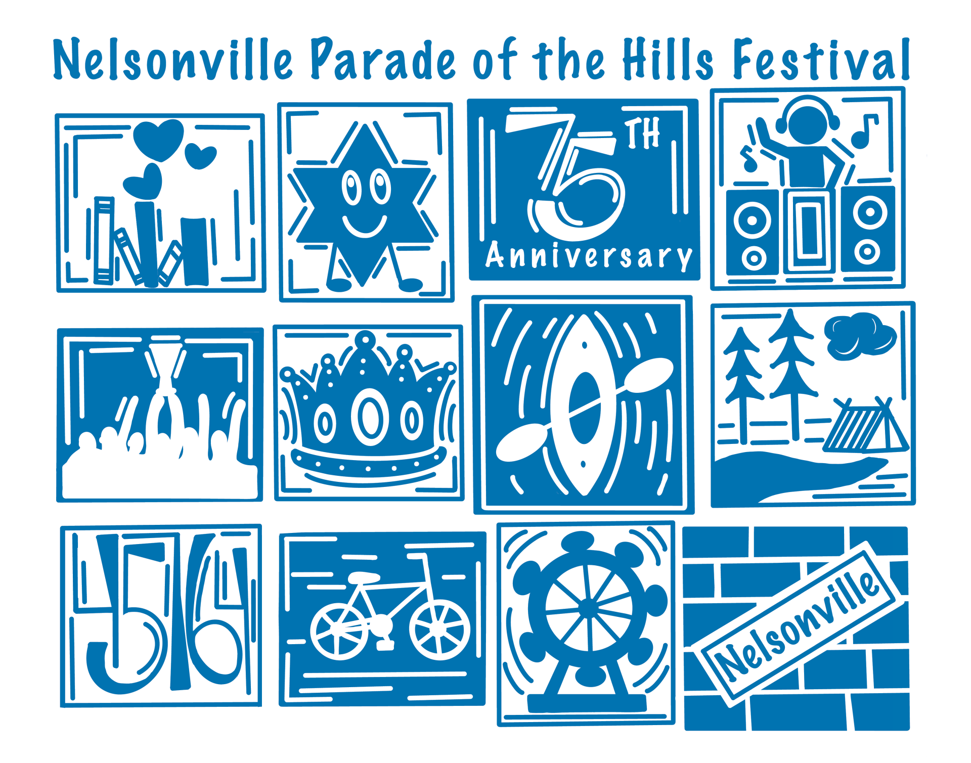
The largest challenge faced in this project was creating a fun/creative design that the people of Nelsonville would be connect to, and at the same time still involving Ohio Health. Also wanting this design to attract people of all ages.
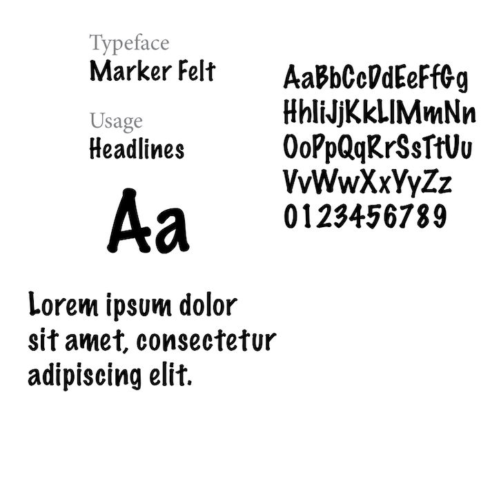
Another challenge in this project was the uncertainty of the production process and its impact on the design’s legibility. The fabric used for the bags has a highly textured surface, which poses difficulties for screen printing. Fine lines and intricate details risked being lost or appearing unclear. Additionally, the fabric’s color could vary, further complicating the design process. To address these issues, we modified our designs to feature thicker lines, simplified details, bold typography, and a single color.
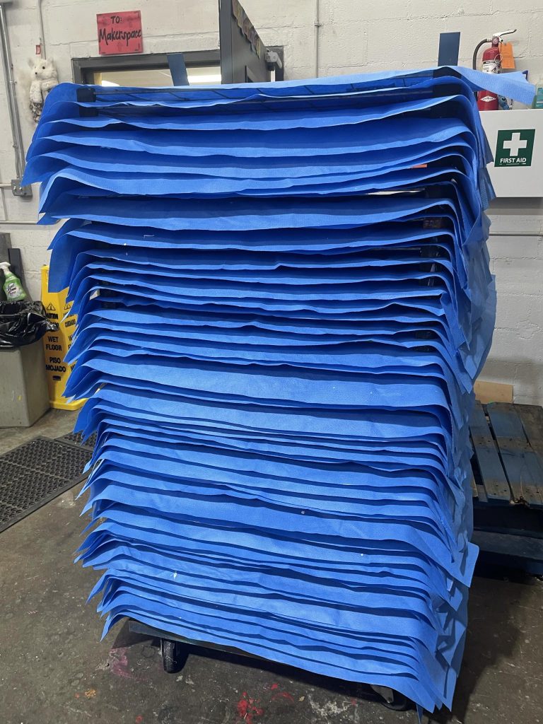
The main deliverable for this project was an artistic design to be screen printed on tote bags created from reclaimed medical fabric.
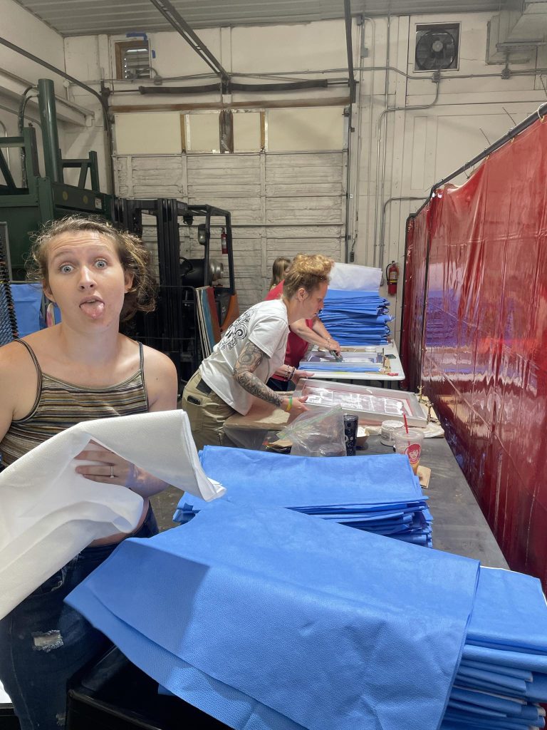
We used digital illustration to create this organic design. The final bags will be printed and sewn by Rural Action, and distributed at Nelsonville Parade of the Hills Festival.
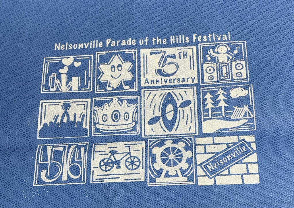
The design process for the Nelsonville Parade of the Hills Festival tote bag focused on striking the right balance between fun, professionalism, and readability. Inspired by the lively spirit of the event and the charm of the local community, the artwork incorporates playful elements like bold illustrations and festive motifs, while maintaining a clean, polished layout that appeals to a broad audience. Careful attention was paid to typography and color choices to ensure that the design remains legible and eye-catching, even when printed on textured fabric. The result is a tote bag that not only celebrates the festival’s vibrant atmosphere but also serves as a functional and stylish keepsake for attendees.
| White #FFFFFF |
SCSS var $color-white |
◯ |
| R 255 G 255 B 255 |
White
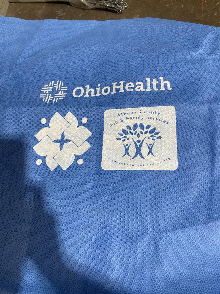
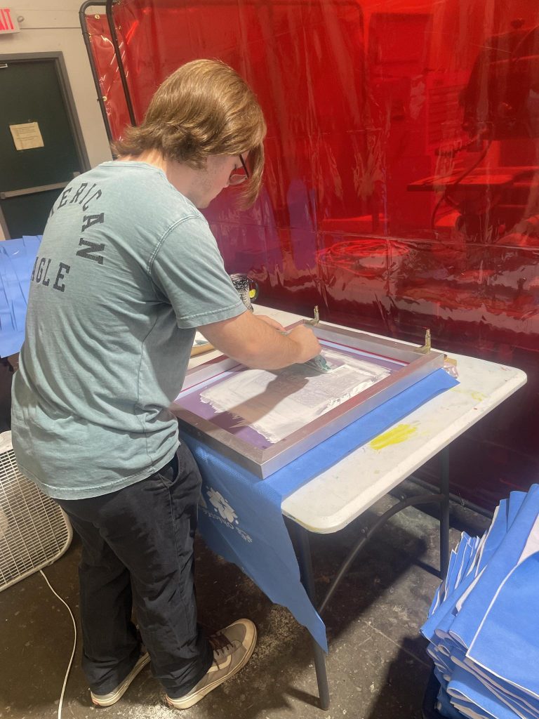
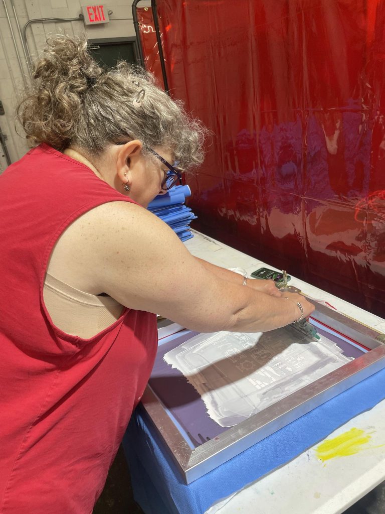
The final stage of the process involved conducting a screen print test to evaluate how the design would translate onto the textured fabric. This test helped us identify which details might be lost during printing and allowed us to explore the most effective techniques for working with the material. Based on the results, we made a few minor adjustments to enhance the legibility of the logo and reduce the loss of detail across the overall design.
Management
Mark Franz
Project Manager
Nathaniel Berger
Account Manager
Creative Direction
Mark Franz
Creative Director
Caroline Murphy
Creative Director
Xenab Malik
Creative Director
Production
Briele Dudgeon
Graphic Design
Kylie Colwell
Graphic Design

