The largest challenge faced in this project was creating a cohesive design that resonated with the client’s previous design style. We kept the same color palette and text and just added some new design elements, like icons and logos, that they could use when creating graphics for their organization.
Another challenge faced in this project was getting the logo to be versatile and cohesive with the rest of the brand identity. We went through multiple design ideas for the logo, but decided on a minimalistic but still visually appealing design.
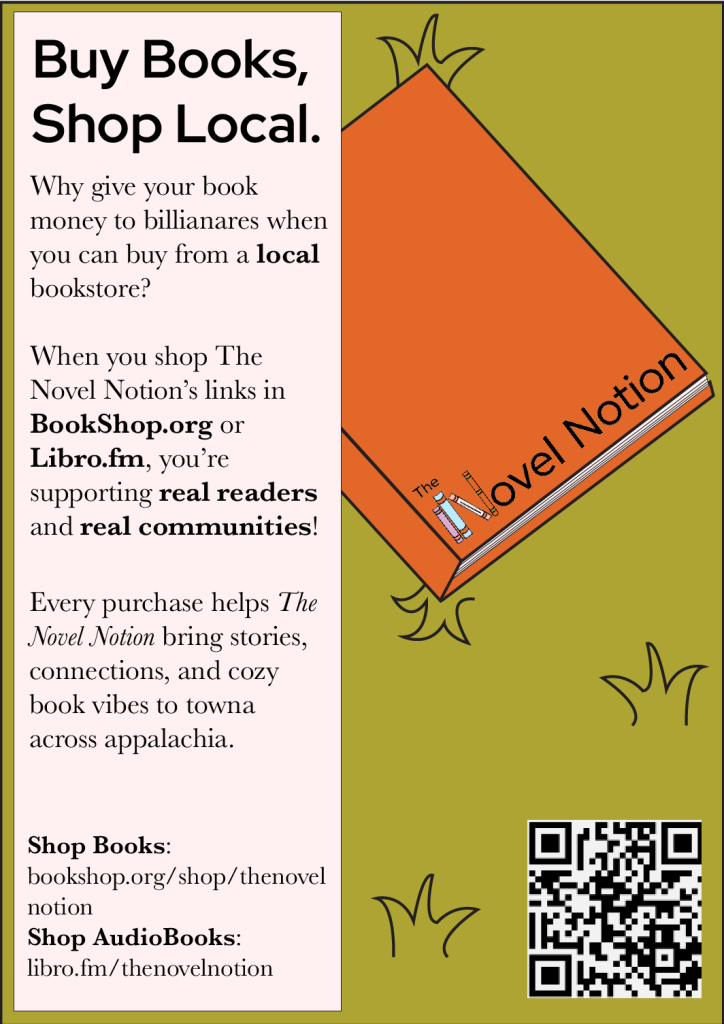
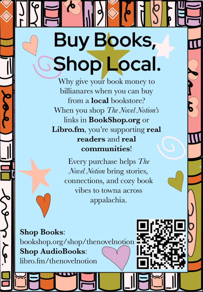
The main deliverable for this project was a rebrand of the logo, quarter sheet advertisements, and a decal for their ArtVend. I included all the design elements that created these designs as icons so they could use them to make any future designs fit the brand identity.
I used digital and hand-doodled illustrations to create the elements of the brand identity and put the individual elements together when making full designs. Below is an image of the whole process design for The Novel Notion, including things that have been discarded and things that were finalized.
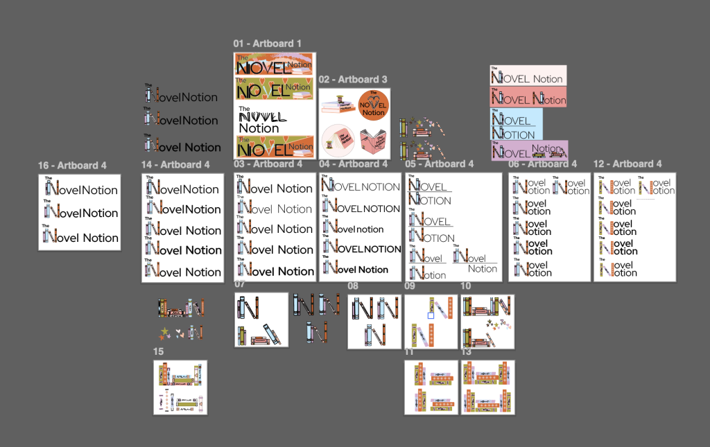
I took the design elements that we agreed upon for The Novel Notion and took those in order to create graphics that communicated the message they were trying to spread.
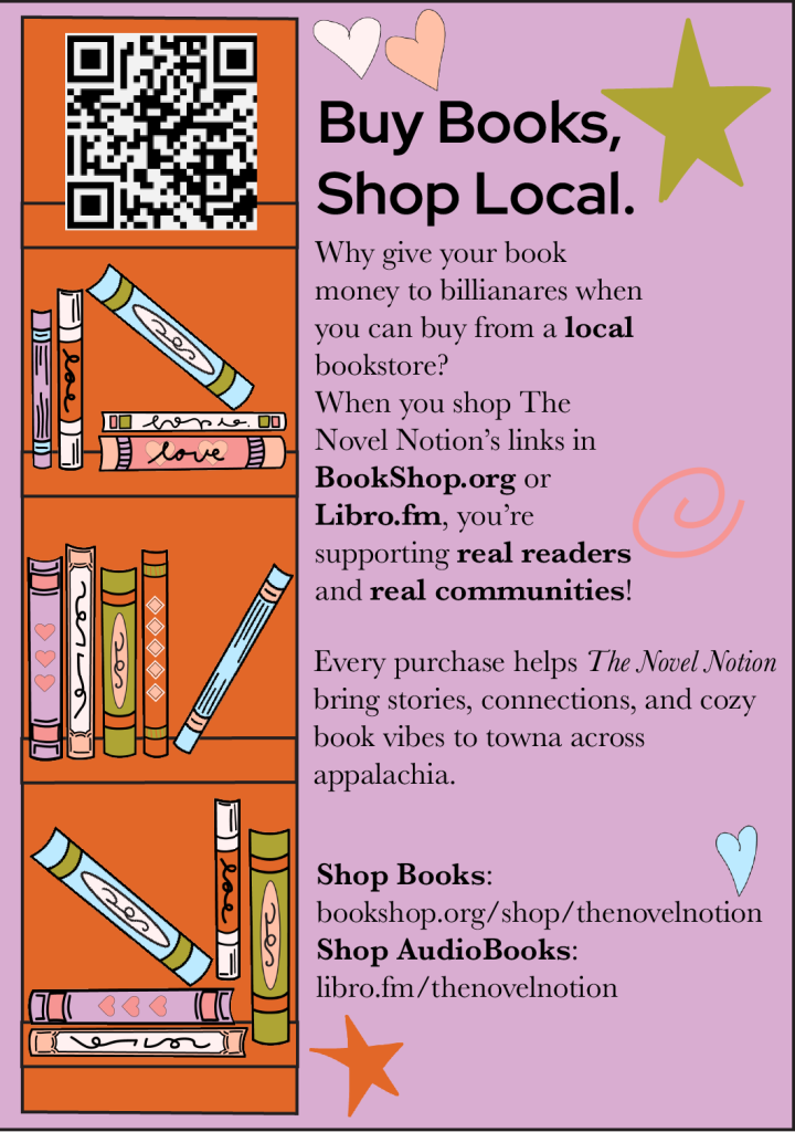
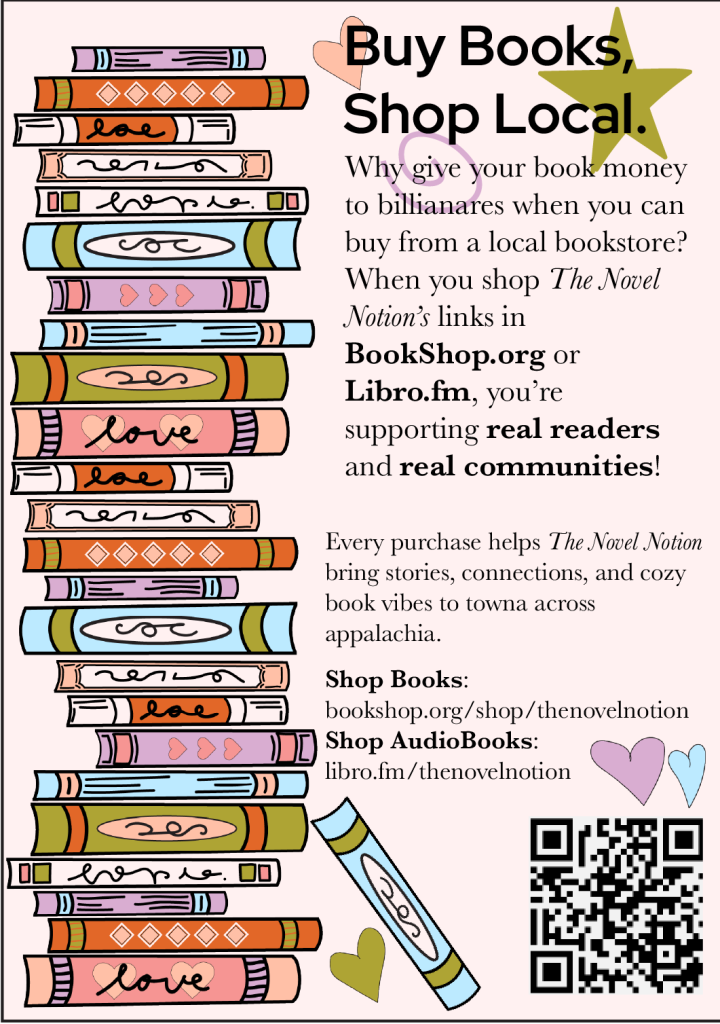
The images below show examples of four quarter-sheet advertisement designs that incorporate a mix of all design elements and have a cohesive visual that matches the brand identity.
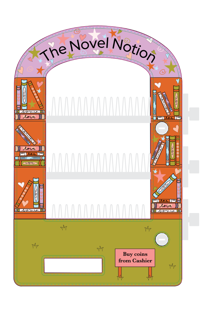
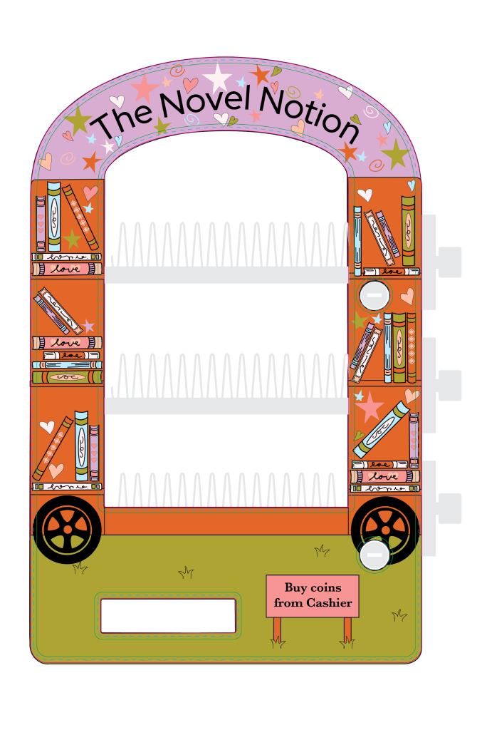
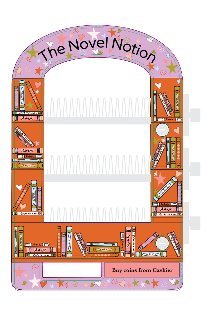
Once the brand identity was decided, they gave me the task of designing a decal for their ArtVend so that it matches the style of their organization.
The images below show examples of three decal designs that portray the same message and visuals as the rest of their brand.
The Novel Notion pink
Pink #f69593
R 246 C 0
G 149 M 51.17
B 147 Y 30.86
K 0
The Novel Notion Peach
Peach #ffc0a7
R 255 C 0
G 192 M 29.28
B 167 Y 29.94
K 0
The Novel Notion Pale Pink
Pale Pink #fff1f1
R 255 C 0
G 241 M 5.54
B 241 Y 1.83
K 0
The Novel Notion Purple
Purple #d9add1
R 217 C 12.24
G 173 M 35.58
B 209 Y 0
K 0
The Novel Notion Blue
Blue #bceaff
R 188 C 23.18
G 234 M 0
B 255 Y 0
K 0
The Novel Notion Green
Green #aea434
R 174 C 35.14
G 164 M 27.05
B 52 Y 100
K 2.06
The Novel Notion Orange
Orange #e26728
R 226 C 7.1
G 103 M 72.86
B 40 Y 98.61
K 0.43
Typeface
Red Hat Display
Usage
Headlines
Typeface
Baskervville
Usage
Body
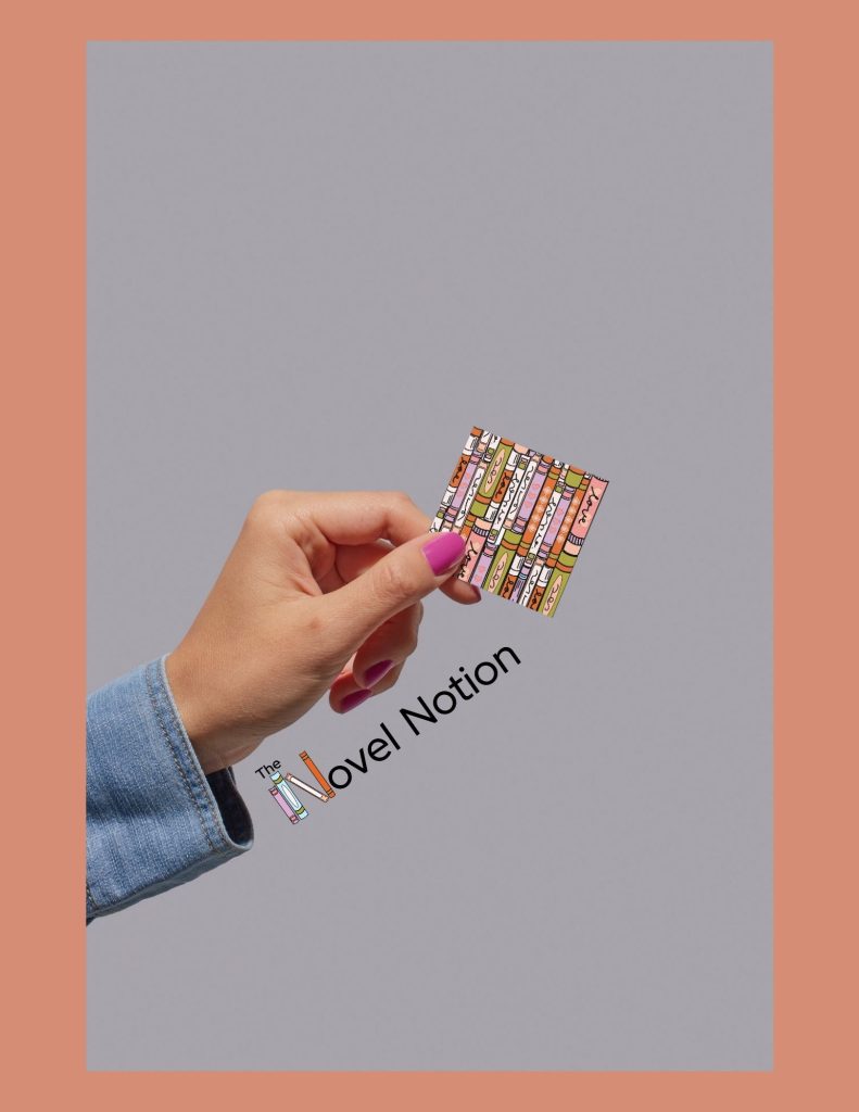
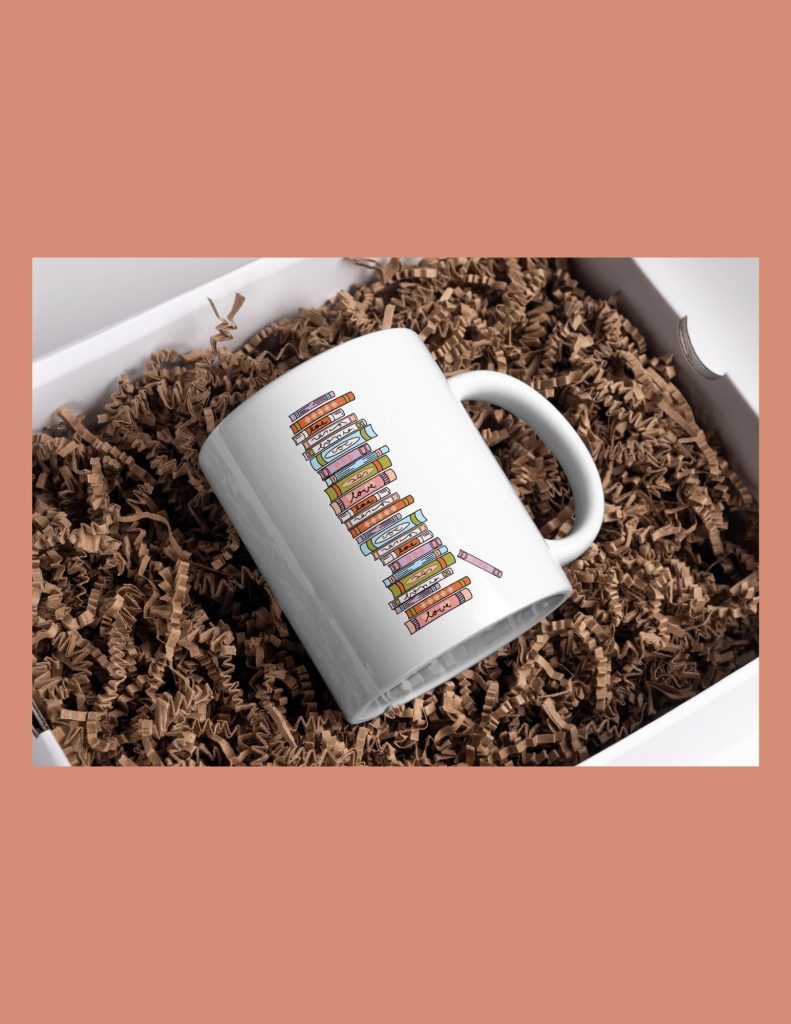
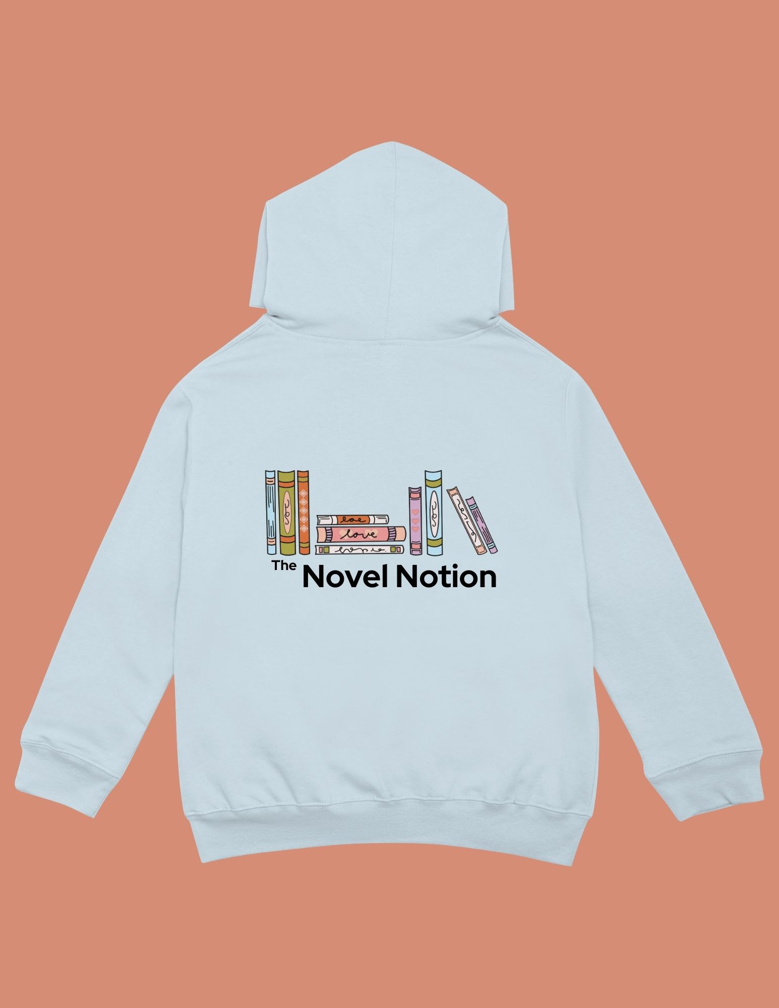
The final step in this process was creating a brand guide of all the new visuals for their brand identity, explaining how to use what and when, and where to use them. I also put together a few mock-ups of some merch they could use the new designs for, and what they would look like. Below are three images of those mock-ups.
Management
Mark Franz
Project Manager
Nathaniel Berger
Account Manager
Creative Direction
Mark Franz
Creative Director
Caroline Murphy
Creative Director
Xenab Malik
Creative Director
Production
Haylee McCutchen
Graphic Design
Audrey Coiner
Graphic Design
Novel Notion


