


In this project it was mainly on creating a brand new logo for the client. They had outgrown their old logo. They had concerns that their logo was too similar to all the others. The Client knew they wanted a tree as their logo. I did research and came up with some options.
We went through some color changes and placing different text in different locations. Some challenges ran into was having the space between the leaves and the hand. I had worried about the readability issues if the text was changed to a different color. Also some other problems I had was placing the leaves in just so that it looks like a tree and getting rid of the extras. It was cleaning up the minor issues. I also made the the lettering in the hand cutout so that whatever it will be placed on it will be transparent onto the hand.
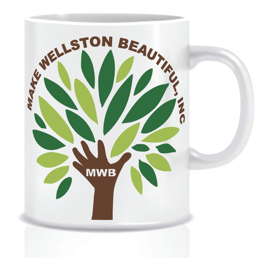
This logo can be placed on different objects and different places for the company.
We started brand new, going from rough ideas and narrowing it down to what they wanted to see. Going through the changes and making improvements throughout the process. Community was a big part of their business and also helping people in their community however they can. The hand reaching showcases the community while making a impact and making a difference.
The images below show examples of early concepts and styles that were explored by the design team. After several rounds of redesigns based on client feedback, we were able to create a compelling design which incorporated a tree-based elements into a free-flowing, nature inspired design.


| Primary #9ABD3C |
SCSS var $color-Green |
◯ |
| R 154 G 189 B 60 |
Light Green
| Dark Green #096e38 |
SCSS var $color-Dark Green |
◯ |
| R 9 G 110 B 56 |
Dark Green
| Digital #6a412b |
SCSS var $color-Brown |
◯ |
| R 106 G 65 B 43 |
Brown
| White #FFFFFF |
SCSS var $color-white |
◯ |
| R 255 G 255 B 255 |
White
Typeface
Baskerville Font
Usage
Headlines
Typeface
Arial Black
Usage
Subheadlines
The final step in this process was creating a logo that the client loves. After showcasing the different variety of the logos the client decided on two different leaves color. Also having the the entire company text around it and in the hand. I have placed it on different mock ups and made minor changes.


Management
Mark Franz
Project Manager
Nathaniel Berger
Account Manager
Creative Direction
Mark Franz
Creative Director
Caroline Murphy
Creative Director
Xenab Malik
Creative Director
Production
Anya Serrao
Graphic Design
Henry Walker
Graphic Design
Make Wellston Beautiful, Inc.