

Getting a grasp of wayfinding guidelines and understanding what makes adequate signage was a challenge I faced while working on this project. I studied what makes signs readable, different styles of signs, fonts, and symbol usage. As a student designer, I had no prior experience with signage design, so much of my time went into researching in order to make good design decisions.
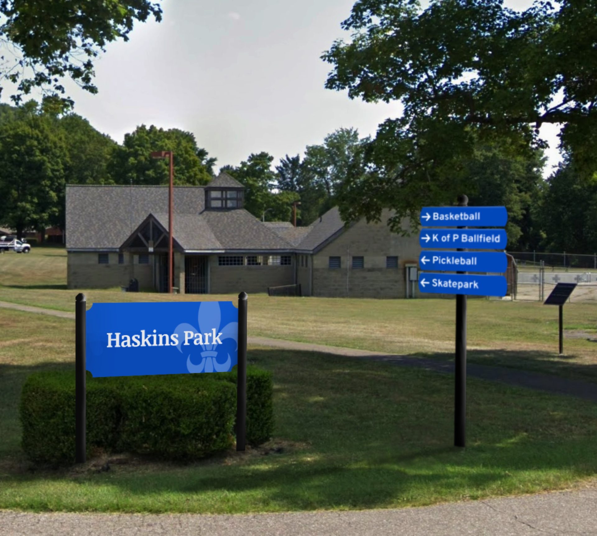
I explored existing signage and wayfinding methods. I narrowed down sign styles I found, and we settled on a style that features the city’s fleur-de-lis symbol floating as a background element. I provided some other existing imagery the clients enjoyed the format/shape of, and further based designs on those.
The signs were meant to be seen from the road. This meant I had to consider appropriate sizes for readability and ensure the contrast on the signage was accessible.


| Royalblue #0047ba |
SCSS var $color-royalblue |
◯ |
| R 0 G 71 B 186 |
Gallipolis Royal Blue
| Lightblue #4173c6 |
SCSS var $color-lightblue |
◯ |
| R 65 G 115 B 198 |
Gallipolis Light Blue
| White #ffffff |
SCSS var $color-white |
◯ |
| R 255 G 255 B 255 |
White for Text and Symbols
Typeface
Noticia Text

Typeface
Overpass

We worked to finalize the designs of the signs by experimenting and working through different sign shapes, styles, and fonts. A royal blue similar to the city’s school colors was implemented. A combination of the fonts Overpass and Noticia Text were applied. Mockups were made to roughly portray what the signs may look like at certain heights in a real world setting. The next step of this project is communicating with Ohio University Printing Services to get the signs made into their physical forms.
Management
Mark Franz
Project Manager
Nathaniel Berger
Account Manager
Creative Direction
Mark Franz
Creative Director
Caroline Murphy
Creative Director
Xenab Malik
Creative Director
Production
Grace Marquis
Graphic Design
Nick Kaiser
Graphic Design
Haskins Park at Gallipolis