

Federal Valley Resource Center
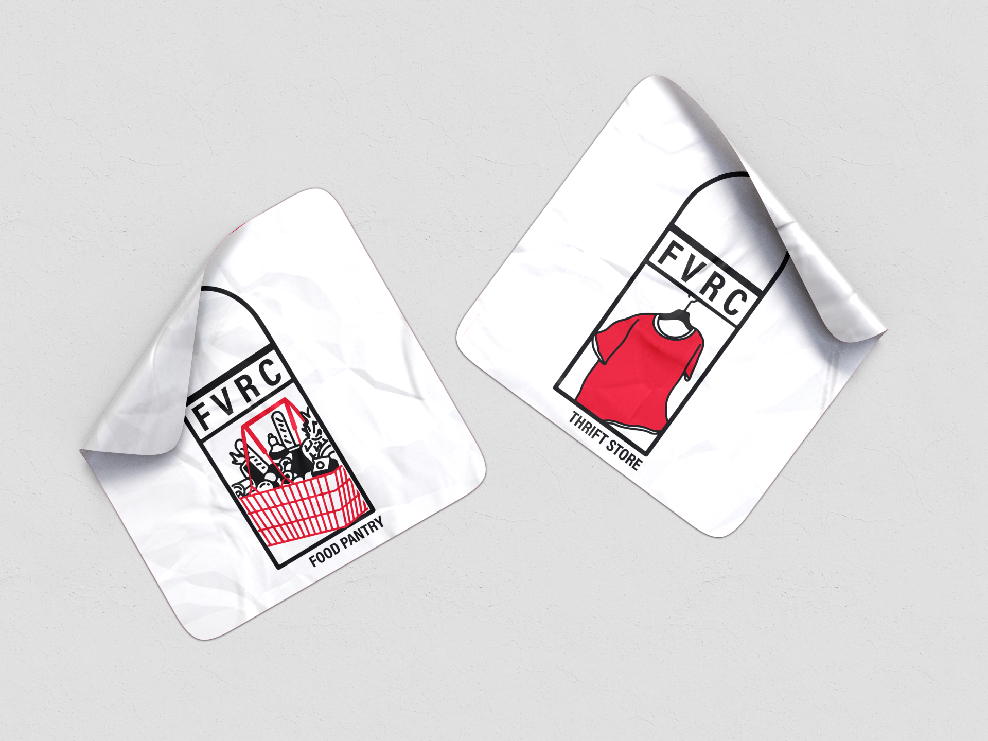


The challenges present in this project were found in both establishing and identifying the historical elements of Federal Valley Resource Center’s (FVRC’s) school house location that were to be translated to a recognizable sub-logo for it’s programming. As FVRC already had a strong logo + color palette that spoke to the buildings former history, we needed to continue this line of thinking in it’s sub branding. Initially, this began as reworking concepts of the original logo bell tower to keep a sense of recognition, before ultimately moving in the direction of the buildings window silhouettes. This was done both to give the sub-logos their own recognizable shape, and to allow for more hand drawn iconography representing each of what the programs had to offer.
Sub-logo’s were created via digital lettering and hand illustration. The final five sub-logo’s are delivered in vector format, with four variants including full color, monochrome white, monochrome black, and monochrome maroon.
We began by examining the brand principals present in the theming and history behind Federal Valley Resource Center, exploring how to construct a new set of sub-branding while keeping true to the guidelines already in place. Through this process, we looked at at major aspects of the buildings history and design in order to keep with the recognizable features already present in the bell tower. Ultimately, this produced 5 variations of “iconography” found throughout the building that were further explored as simplified sub-logo concepts.
Below are early adaptations of design concepts and style that play on both the bell tower and large windows associated with the old school house Federal Valley Resource Center. After multiple rounds of redesigns/redefining sub-logo expectations, we were able to create five sub-logo designs based on the main programming “groups” FVRC offers towards the community, taking inspiration from windows and iconographic, hand drawn imagery.


| Primary #000000 |
SCSS var $color-black |
◯ |
| R 0 G 0 B 0 |
FVRC Black
| Navy #e50039 |
SCSS var $color-maroon |
◯ |
| R 229 G 0 B 57 |
FVRC Maroon
| Digital #ffffff |
SCSS var $color-white |
◯ |
| R 255 G 255 B 255 |
FVRC White
Typeface
Acumin Variable Concept
Usage
Headlines
The final step of establishing FVRC’s sub-branding was to create a style guide for any future expansion/implementation of their programming. This continued with creating mockups of how the sub-logo’s could be used to better promote their programming, allowing us to see if more or less detail was needed/test legibility and accessibility of the sub-logo.
Below are examples of implementation via FVRC’s most utilized mode of communication, Facebook.


Management
Mark Franz
Project Manager
Nathaniel Berger
Account Manager
Creative Direction
Mark Franz
Creative Director
Caroline Murphy
Creative Director
Xenab Malik
Creative Director
Production
Ellie Sabatino
Graphic Design
Al Coumbassa
Graphic Design