


The largest challenge faced in this project was incorporating a unique and engaging color palette throughout the web pages. The client wanted something flashy yet modern, but their current brand kind of limited the flexibility of color usage. Balancing their established aesthetic with trying not to be too fancy was difficult at time to explain to them.
Another major challenge was navigating a new website builder platform that I hadn’t previously used. While it did have some convenient features, it also came with a learning curve and unexpected limitations when it came to customization. I had to troubleshoot issues on the fly and find creative workarounds to bring the vision to life while still delivering a clean and functional user experience.
I also wasn’t receiving timely and specific feedback from the client. Communication delays and vague direction made it difficult to move forward confidently at times. I had to learn how to ask the right questions and present options in a way that made it easier for the client to respond and make decisions.
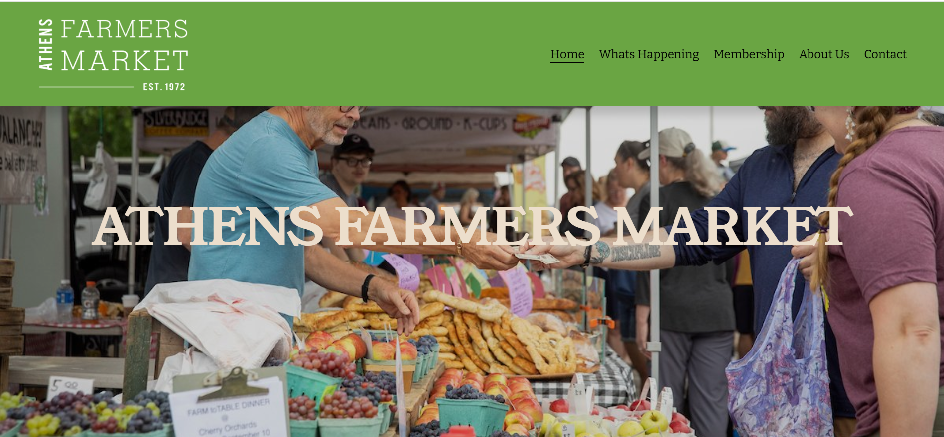
The main deliverable for this project was a website that reflects the client’s brand while offering a refreshed interface. The final site is visually engaging, easy to navigate, and adaptable for future updates and content changes.
I began by carefully reviewing the client’s existing brand guidelines to understand their visual identity, tone, and overall messaging. I created multiple templates, working to strike a balance between a visually engaging experience and staying true to the client’s established brand identity until I landed on one we both enjoyed.


| Primary #6AA543 |
SCSS var $color-green |
◯ |
| R 106 G 165 B 67 |
Apple
| White
#ecdecc |
SCSS var $color-white |
◯ |
| R 236 G 222 B 204 |
Stark White
| Gray #b9a590 |
SCSS var $color-gray |
◯ |
| R 185 G 165 B 144 |
Heathered Gray
| White #FFFFFF |
SCSS var $color-white |
◯ |
| R 255 G 255 B 255 |
White
Typeface
Young Serif
Usage
Headings

")
Typeface
Bitter
Usage
Paragraphs
The last step in the process was making sure the design felt cohesive across every page of the site. Once all the content was in and the pages were built out, I went back and made adjustments to things like fonts, colors, spacing, and button styles to make sure everything felt consistent. It was important that no matter what page someone landed on, it felt like part of the same site. Those final tweaks really helped tie everything together and gave the site a more polished look


Management
Mark Franz
Project Manager
Nathaniel Berger
Account Manager
Creative Direction
Mark Franz
Creative Director
Caroline Murphy
Creative Director
Xenab Malik
Creative Director
Production
Almamy Coumbassa
Graphic Design
Ellie Sabatino
Graphic Design
Athens Farmers Market