ACE
Task
Logo Design
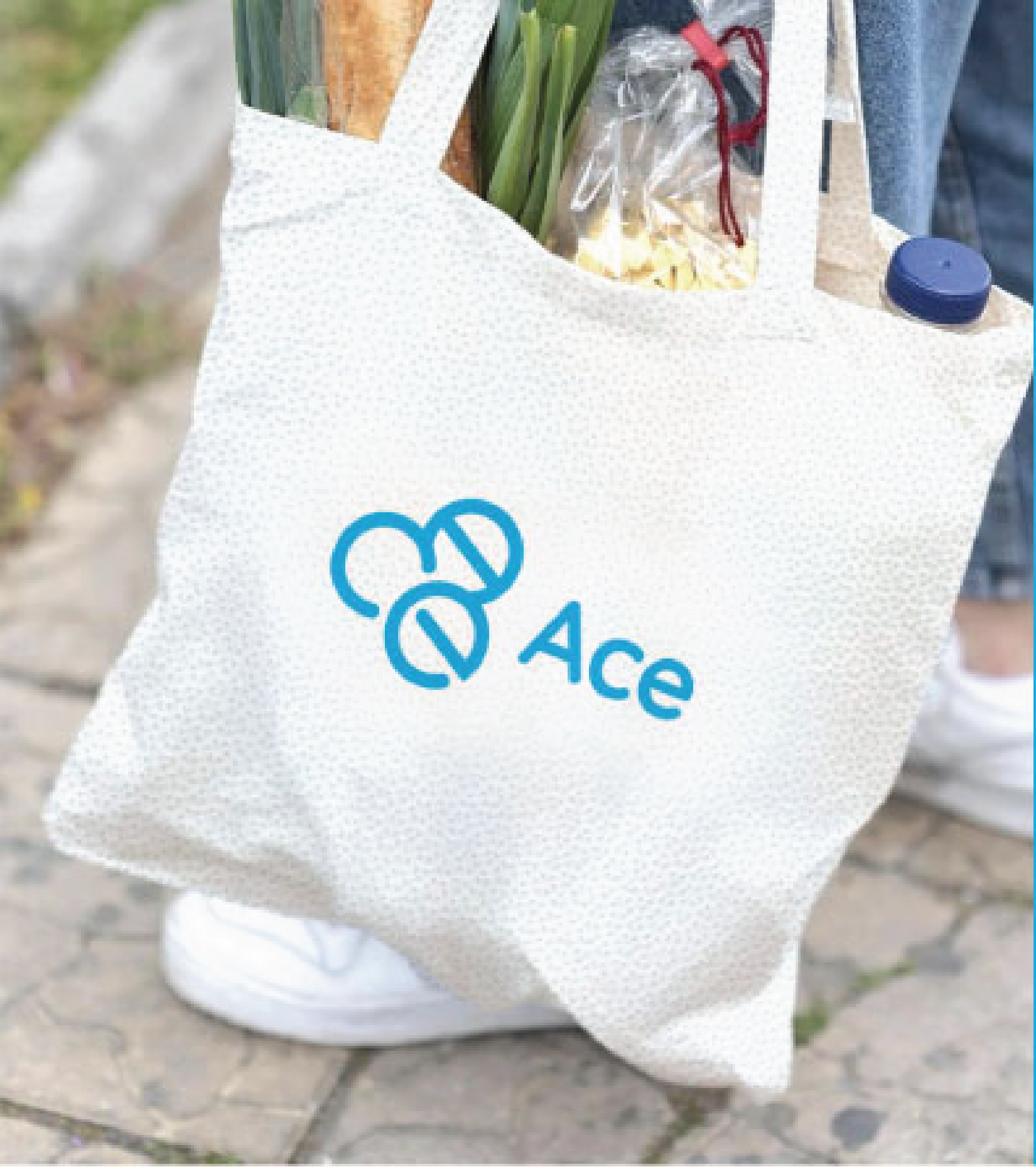
This project supports a social enterprise transforming hospital sterilization wrap into reusable products, such as bags, while creating workforce opportunities in Appalachian Ohio. The acronym ACE stands for Acceleration of the Circular Economy—a name that captures the project’s emphasis on upcycling, sustainability, and community-driven innovation.
The primary challenge was the evolving nature of the project during the branding phase. The team had not yet finalized a name or unified vision when the design process began, which made it difficult to anchor the visual identity. As the designer, I navigated this ambiguity by researching the project’s goals, materials, and values to define a direction that could reflect the circularity and impact at the heart of the initiative.
This project was a valuable opportunity to explore branding at the intersection of sustainability and social impact. While the design brief evolved throughout the process, it allowed room for experimentation and research-driven decision-making.
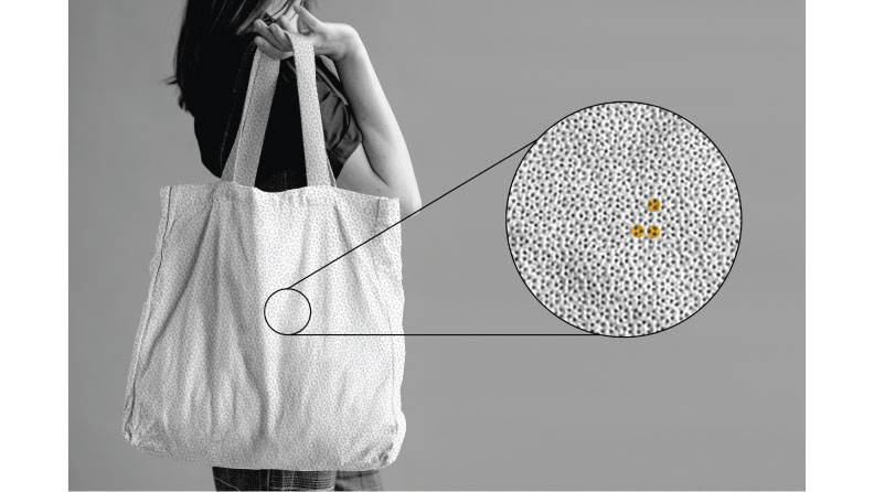
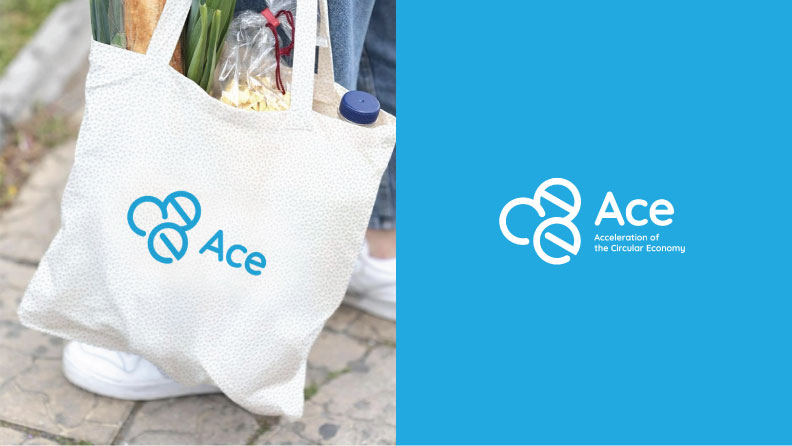
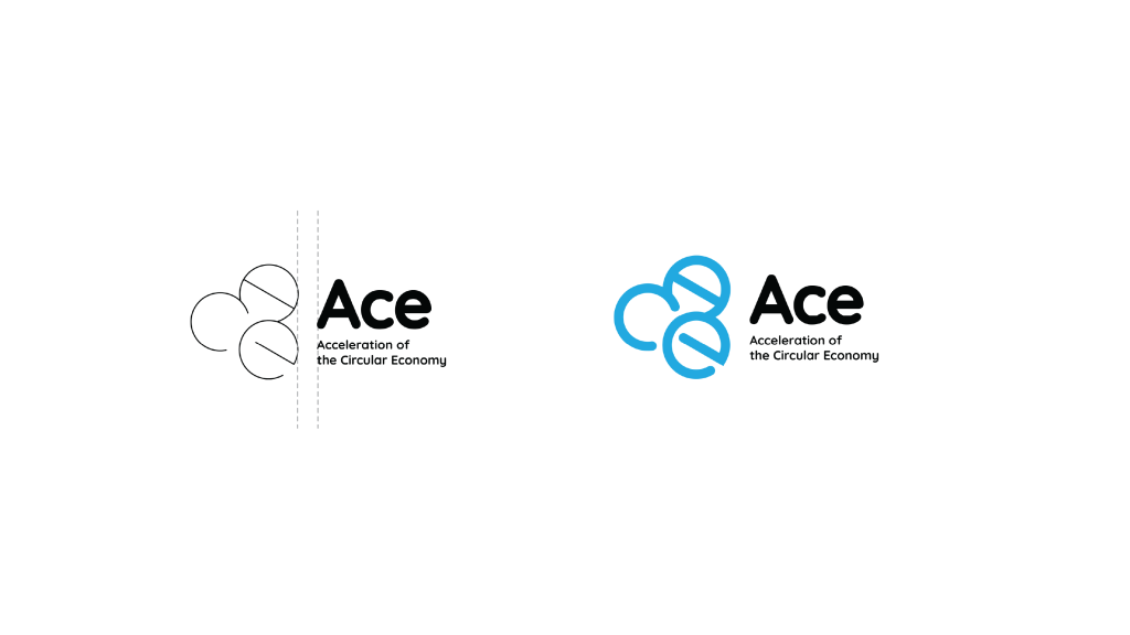

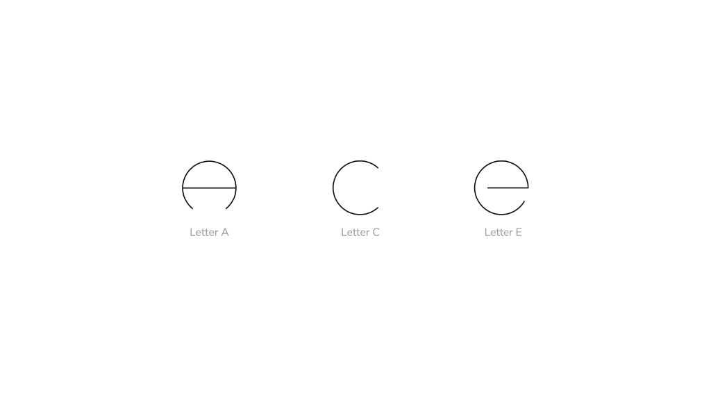
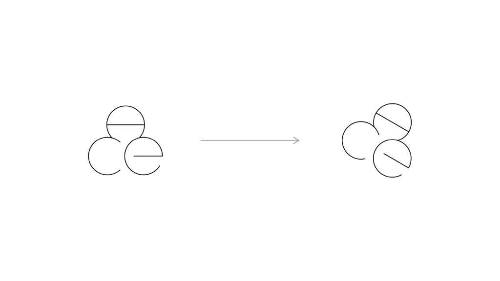
The logo was inspired by the circular texture of the blue sterilization wrap material. Upon close examination, a recurring cluster of three circular forms stood out—these became the foundation for the custom letters A, C, and E. Each letter was constructed using minimal circular strokes, and their final composition was arranged into a triangular cluster, reflecting the material’s internal structure. The final mark captures the cyclical nature of the project while remaining adaptable, clean, and distinct.
Management
Mark Franz
Project Manager
Nathaniel Berger
Account Manager
Creative Direction
Najmeh Pirahmadian
Creative Director
Production
Najmeh Pirahmadian
Graphic Design


