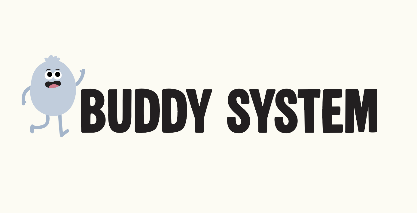
Emotion Sandbox App

Task

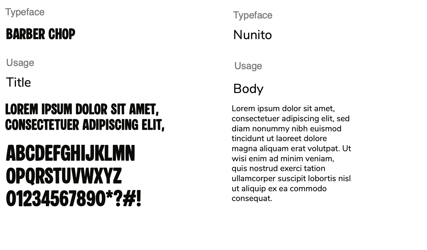
Design a brand identity and character system for a mobile app

  • Strategy

    Visual identity, Character Design

  • Design

    Brand Identity, Character System

  • Client

    Reid Software

⬤ 01. Challenges

Design Challenges

The hardest part of this project was creating a character that felt friendly and engaging, while still making it clear that the app is meant to help people with social anxiety. The design had to convey emotions such as nervousness, comfort, and confidence without coming across as too childish or distracting. Striking the right balance between playful and realistic required careful work on the character’s shape, facial expressions, and overall style.
The main deliverable for this project was a cohesive visual system for the app, centered around a versatile, expressive character. This included character poses, emotional states, supporting assets such as typography and color palette, a set of logo variations, and a fully developed app icon designed to work alongside the character, reinforcing a calm, friendly, and supportive user experience.

.

⬤ 02. Experience

Balancing emotion, usability, and clarity

Throughout the design process, various character styles, poses, and emotions were explored to achieve an optimal balance between expressiveness and clarity. The objective was to create a character that appeared lively and relatable while remaining compatible with a simple, clean user interface. Adjustments were made to body language, size, and placement to enhance users’ understanding of the character’s emotions.

The images below show examples of early concepts and styles that were explored by the design team. Through ongoing improvements, we developed a consistent character system centered around a primary avatar with refined proportions. These adjustments ensured the character aligned with the overall simplified visual style, improving readability, consistency, and usability across the app.

Color palette

/ Foundations

#a6cd8a

R 165
G 205
B 138

Sage

#d8bdd7

R 216
G 189
B 215

lavender

#f4d07d

R 244
G 208
B 125

Honey

#c0ccdb

R 192
G 204
B 219

Mist Blue

#93cbc2

R 147
G 203
B 194

Muted Teal

#e89663

R 232
G 150
B 99

Orange

Digital
#eaacc8

R 234
G 172
B 200

Blush Pink

#fcfbf3

R 252
G 251
B 243

Soft Ivory

Typography

/ Scales

⬤ 03. Process

Testing and finalizing

The final stage of the project involved refining and selecting character poses, logo variations, and app icon concepts to identify those that best conveyed the app’s tone and purpose.
We finalized the primary avatar system, ensuring consistent proportions, line weight, and body language across all use cases. After finalizing the decisions, we organized the assets,  including character variations, logo systems, and the app icon, into a cohesive design system. This approach ensures consistency across the app and establishes a clear foundation for future development.

Credits

Management

Mark Franz
Project Manager

Nathaniel Berger
Account Manager

Creative Direction

Mark Franz
Creative Director

Caroline Murphy
Creative Director

Xenab Malik
Creative Director

Production

Jordyn Roderick
Graphic Design

Brooklin Clonch
Graphic Design

Propose a project through our parent organization, the Lights Regional Innovation Network.

Ready to work together?
Back

This website stores cookies on your computer. Cookie Policy