| Primary #3FACE4 |
SCSS var $color-Main Blue |
◯ |
| R 63 G 172 B 228 |
Dirty Girl Coffee
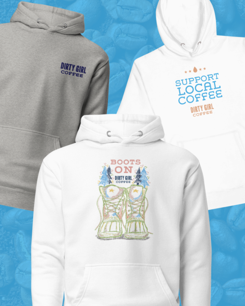
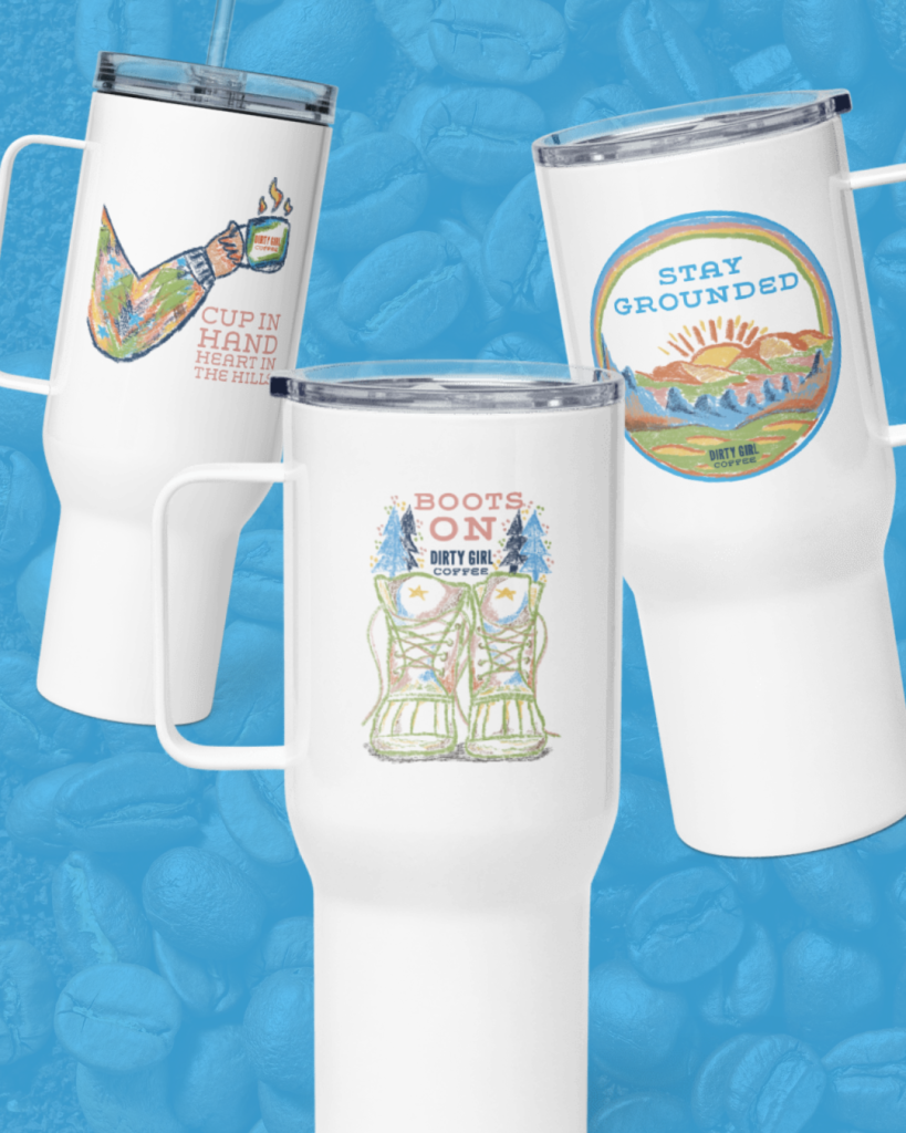
This project was about creating new collateral merchandise for Dirty Girl Coffee to use. The client wanted fun, new, and consistent designs to use for various marketing needs. We wanted these new designs to be as intentional and thought out as possible. Being consistent with the company’s existing branding was the most important asset to follow as we worked on this project.
Task
Maintaining brand consistency

The main challenge faced in this project was creating designs that ultimately showcased the values of the brand while making them fun and exciting for customers.
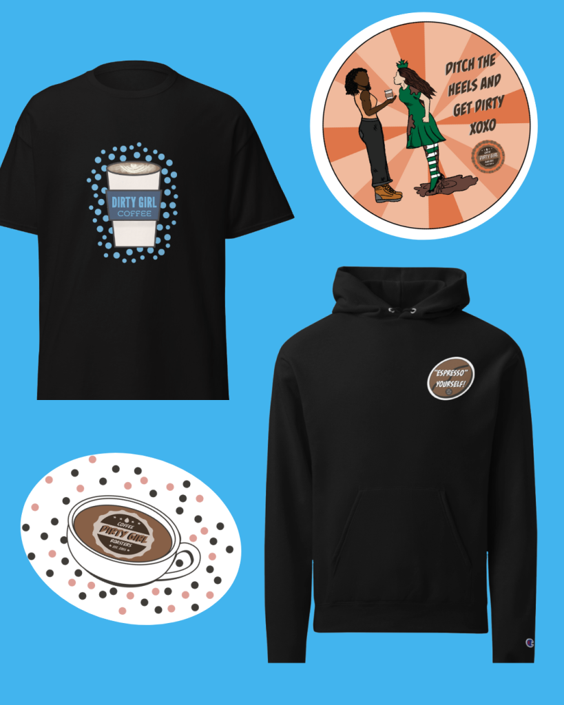
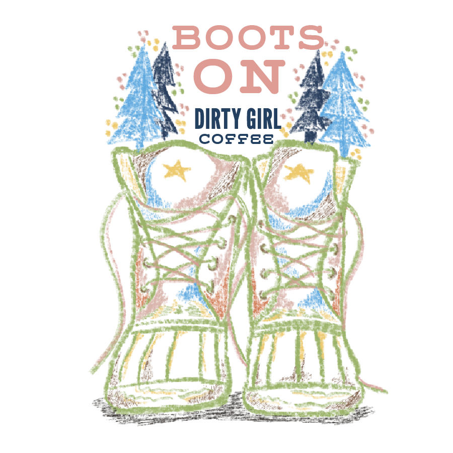
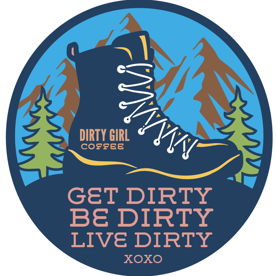
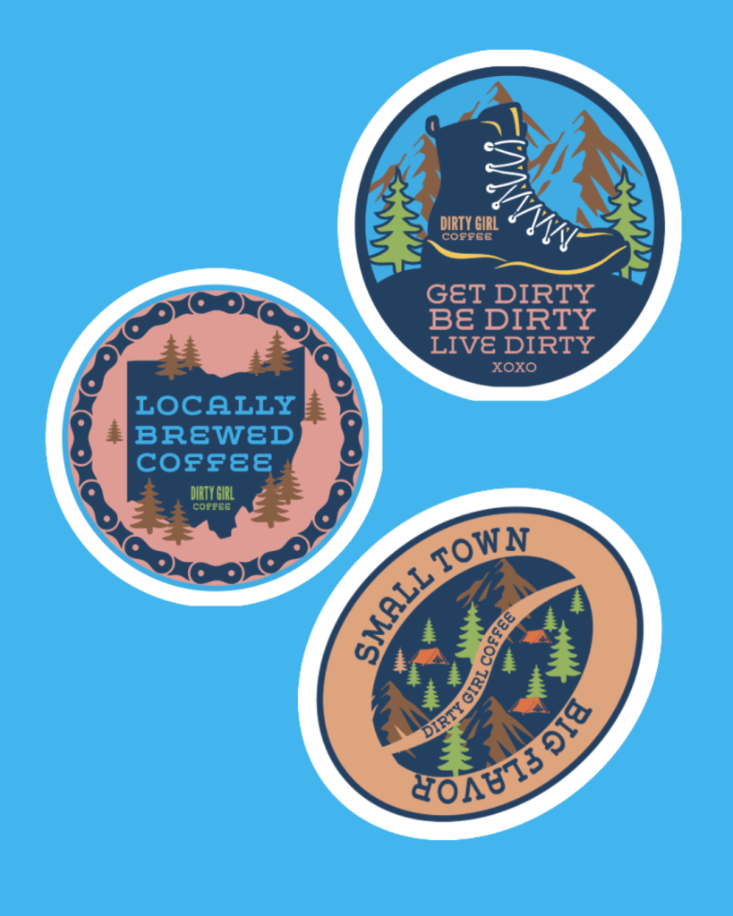
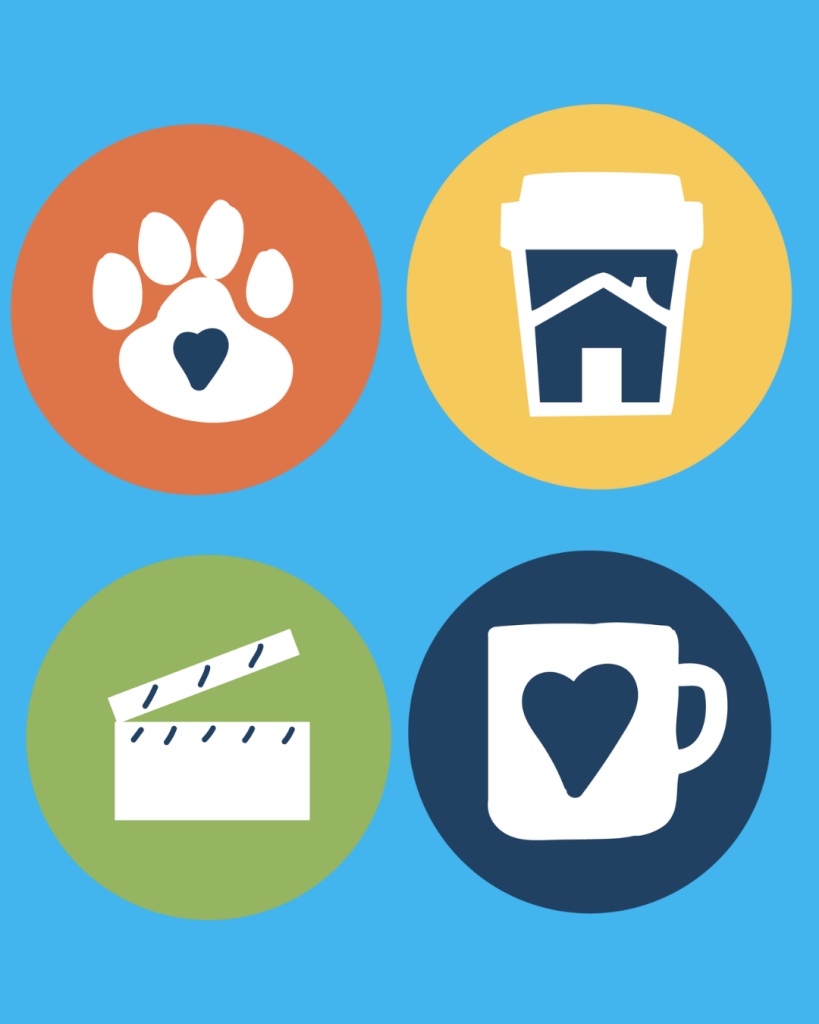
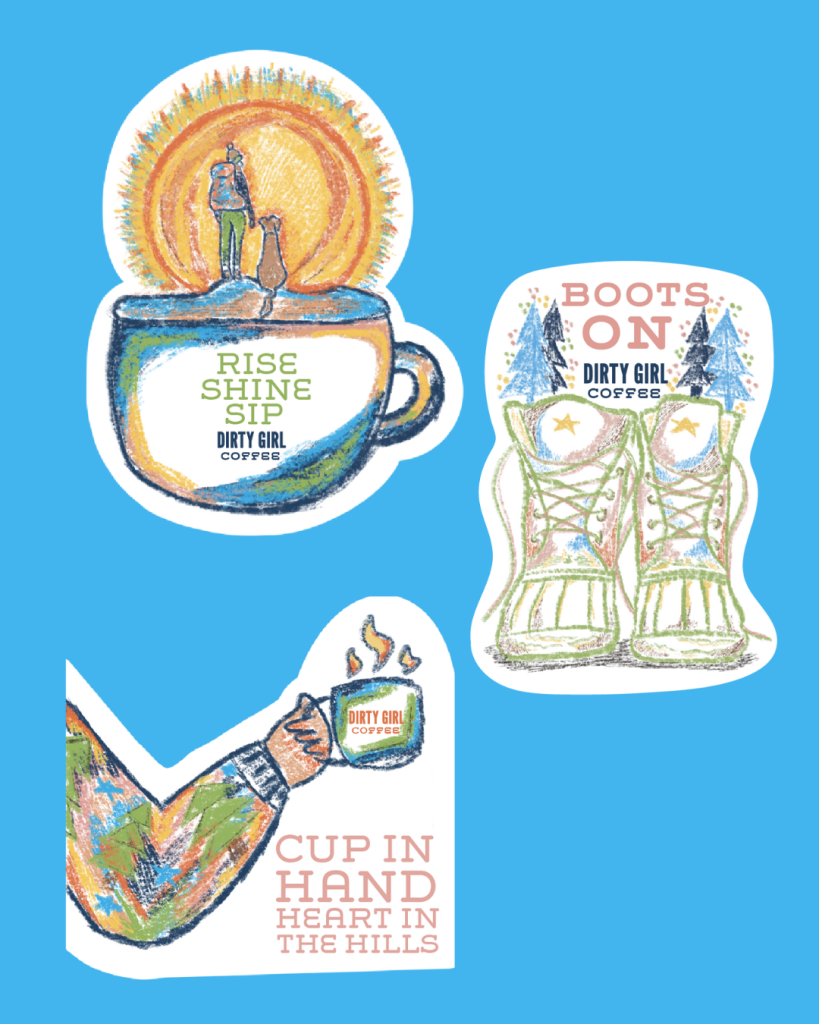
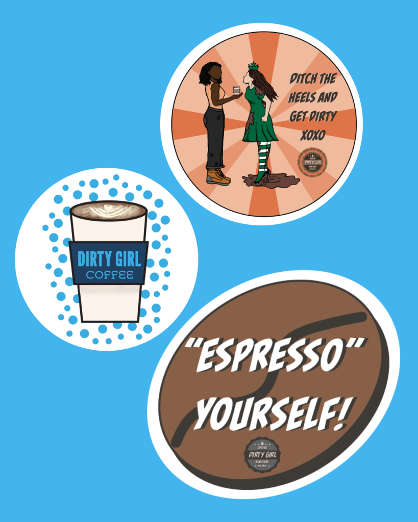
Dirty Girl Coffee expressed how they were in need of some new merchandise designs such as stickers, t-shirts, etc. These designs required existing brand colors plus adding a couple new colors to help bring in some contrast. As a result, three different styles of merchandise designs were created that still feel connected to the brand, but are new and different to the brand.
A conflicting challenge that surfaced was the primary logo, it wasn’t quite working in the sticker designs. We created an alternative logo for the brand to use as a simpler version of the primary logo, but is still as effective for the brand’s message.
We used digital illustration and hand drawing to bring these new designs to life. They will be printed for the brand to use for various needs.
Throughout this process we communicated with the client to figure out exactly what the vision was for this project and how we could execute it. We discussed what styles, colors, and deliverables would be best to communicate the brands needs. We wanted to make sure that it kept with the brand’s consistency and communicates the brand’s message, but still allowed for new ideas to surface.
| Primary #875f45 |
SCSS var $color-brown |
◯ |
| R 135 G 95 B 69 |
Woodsy Brown
Main Blue
| Primary #3F3A37 |
SCSS var $color-Charcoal |
◯ |
| R 63 G 58 B 55 |
Charcoal
| Navy #DEA47E |
SCSS var $color-orange |
◯ |
| R 222 G 164 B 126 |
Light Orange
| Primary #234061 |
SCSS var $color- Dark Blue |
◯ |
| R 35 G 64 B 97 |
Dark Blue
| Digital #DE9C94 |
SCSS var $color- Light Pink |
◯ |
| R 222 G 156 B 148 |
Light Pink
| Primary #DD7448 |
SCSS var $color- Dark Orange |
◯ |
| R 221 G 116 B 72 |
Dark Orange
| White #95B45F |
SCSS var $color-Green |
◯ |
| R 149 G 180 B 95 |
Green
| Primary #F5C85A |
SCSS var $color- Yellow |
◯ |
| R 245 G 200 B 90 |
Yellow
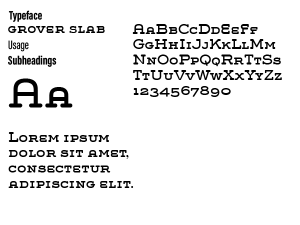
Typeface
Bebas Neue
Usage
Headlines
We started this project with an idea of the client wanted, but wasn’t sure how to fully pull off the vision. Through the meetings we had all semester, we narrowed down the art styles, imagery, color palette, and the typography. With all of these assets we were able to make designs that felt connected with the brand and most importantly what the client loved.
Management
Mark Franz
Project Manager
Nathaniel Berger
Account Manager
Creative Direction
Mark Franz
Creative Director
Caroline Murphy
Creative Director
Xenab Malik
Creative Director
Production
Jalynn Eberts
Graphic Design
Kelly Shaver
Graphic Design


