Heartwoods Mental Health LLC
Task
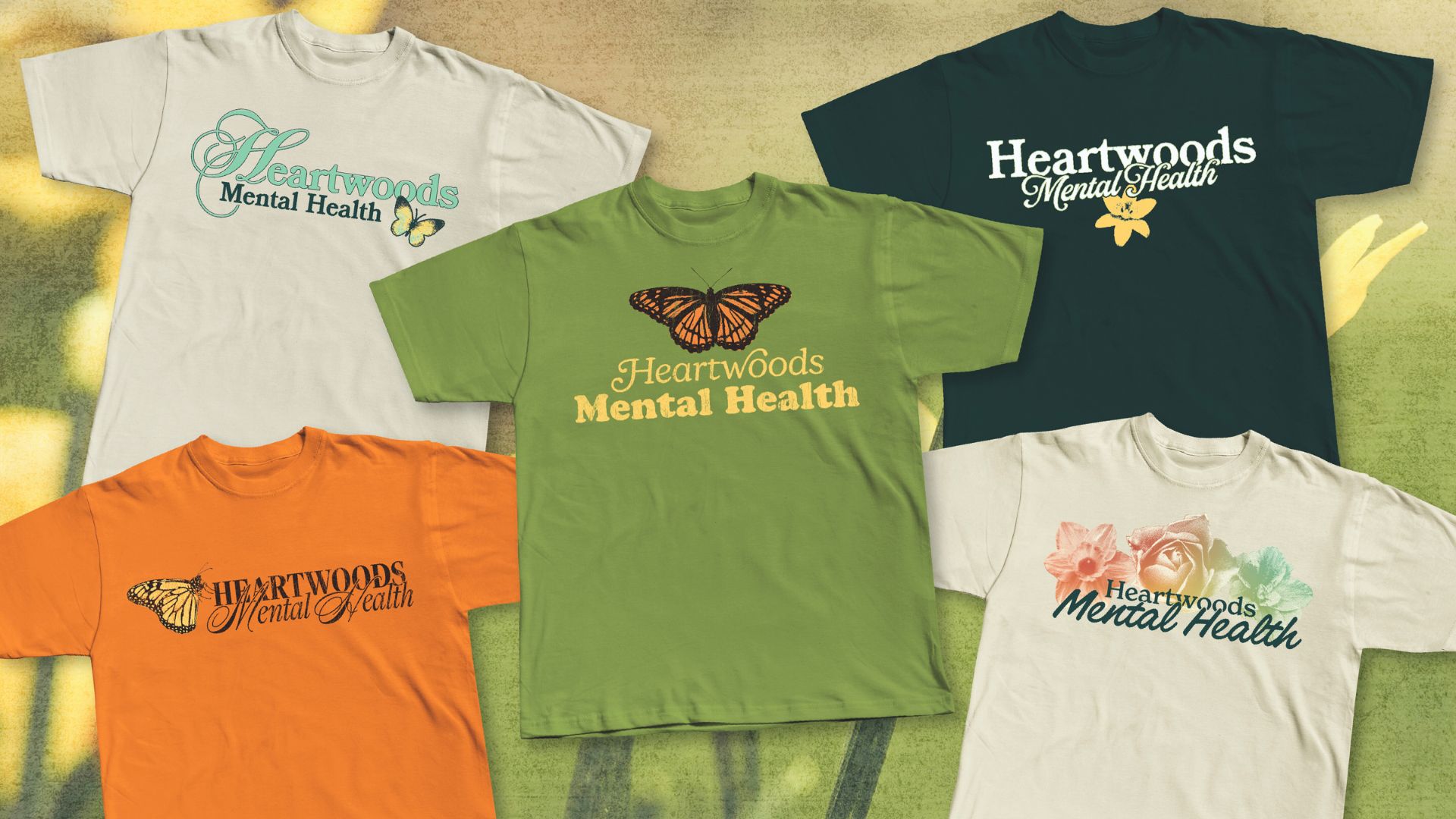
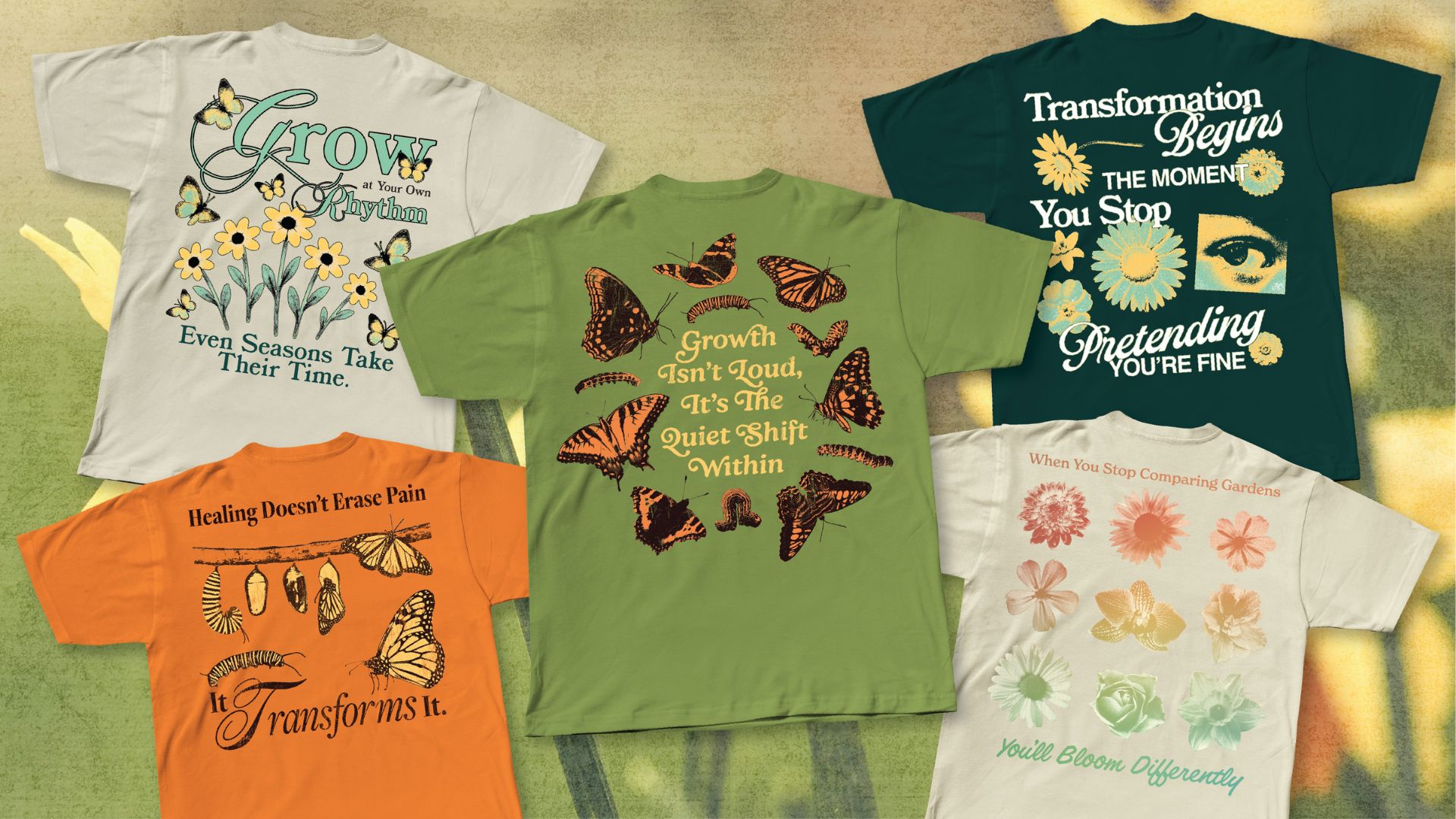
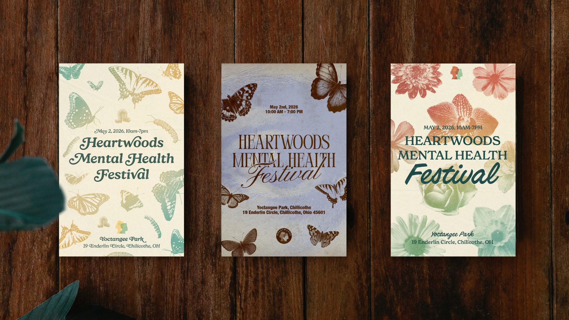
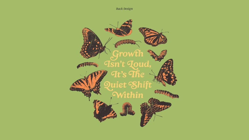
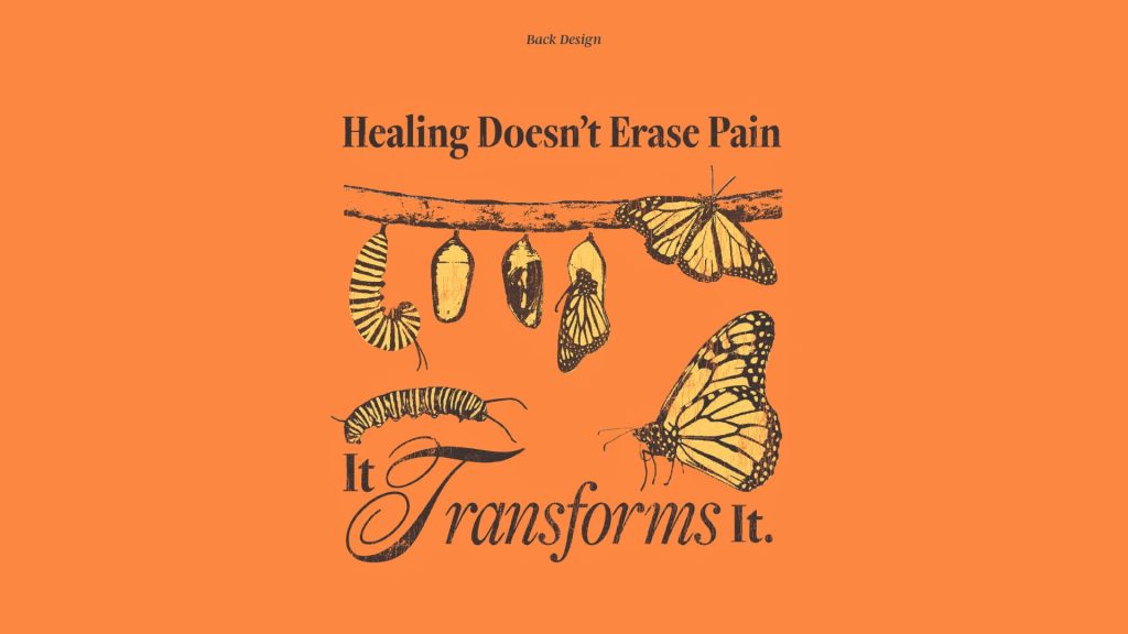
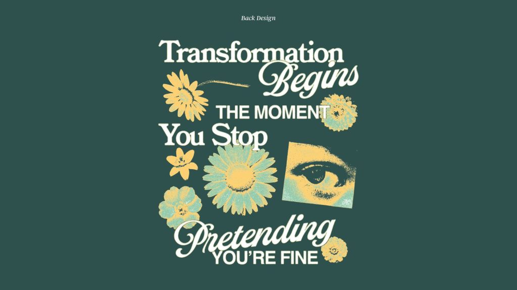
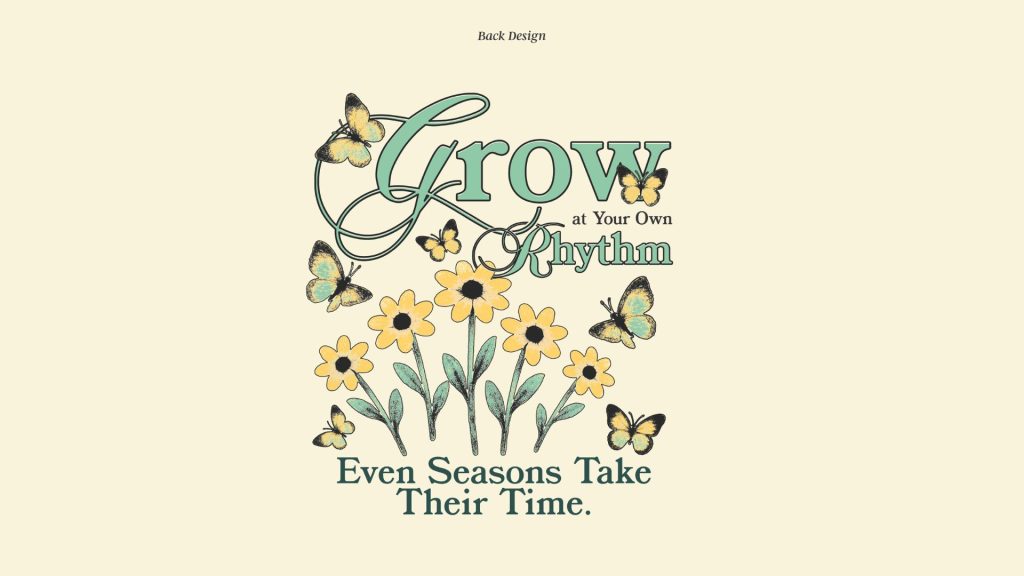
For this project, our main goal was to connect with men in the community and spotlight the importance of self care and mental health. Using a limited color palette, we were tasked to create 5 unique t-shirt designs that reflected the values of the organization, as well as 3 posters to promote the upcoming Mental Health Festival in Chillicothe.

The biggest goal for this project was to create materials that connect with men in the community, acknowledging how often their mental health needs are overlooked or minimized. This was made a slight challenge when the main modes of messaging were through typically feminine imagery like flowers and butterflies. By using modern, trendy elements such as texture and vintage distressing, the designs are made for a larger crowd, encouraging more people to gain interest into what Heartwoods is all about.
By focusing on relatability to the audience and striking visuals, each design encourages men to recognize their own experiences, encouraging them to reach out for help if they need it. The work created for this project ultimately strives to invite the community into an organization that provides the resources, connection, and care they need.
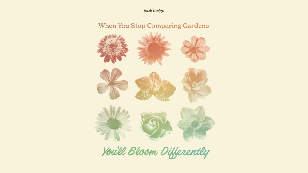
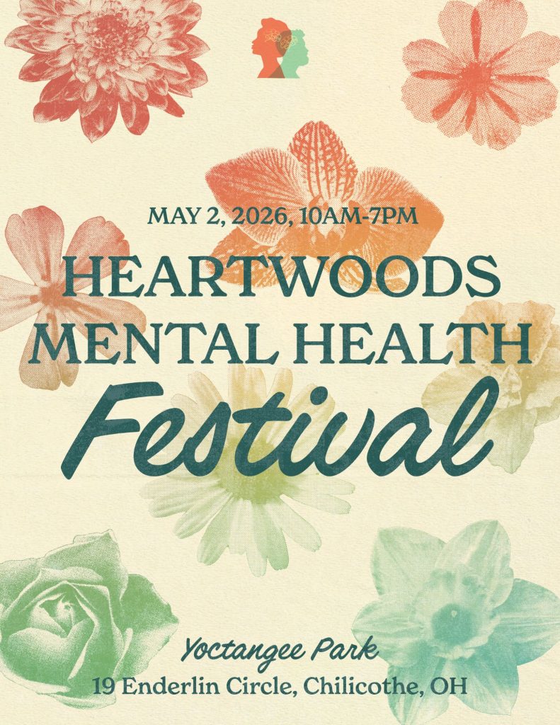
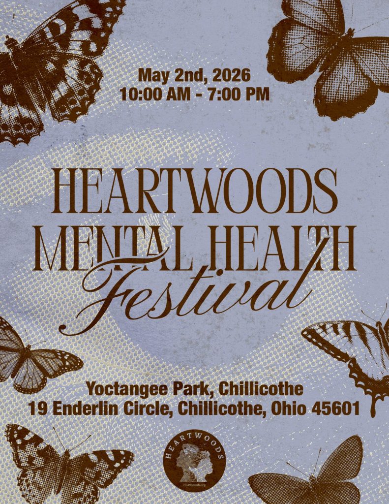
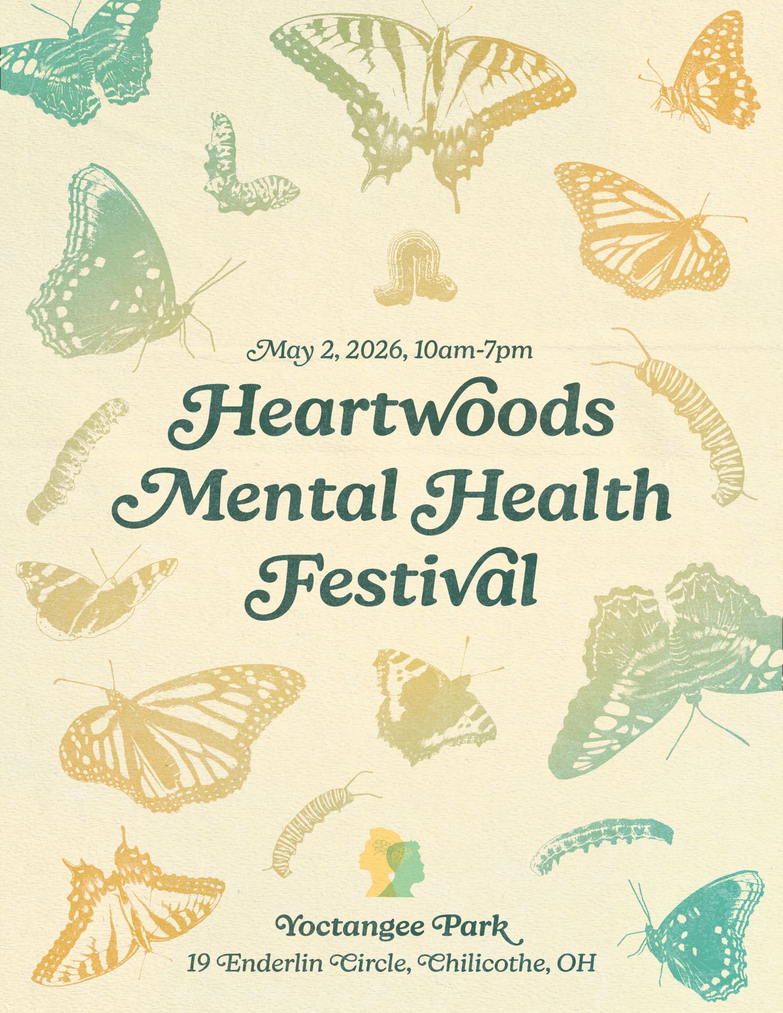
After deciding on a vintage, warm, happy approach to this project, we began with selecting colors that felt bright and inviting, avoiding anything too muted or clinical. Visuals were chosen based on the messaging being used, ultimately landing on visual metaphors for growth and transformation, common themes of Heartwoods as an organization.
From there, the organization’s sayings were paired with the chosen imagery, adjusting layouts and hierarchy to keep each design unique, but cohesive as a collective. By combining our chosen colors, unique typography pairings, striking visuals, and Heartwoods’ kind messages, our final pieces were designed to gravitate towards men in the community in hopes to emphasize the importance of mental health.
| Primary #154642 |
SCSS var $color-teal |
◯ |
| R 21 G 70 B 66 |
Heartwoods Teal
| Primary #f68742 |
SCSS var $color-orange |
◯ |
| R 246 G 135 B 66 |
Heartwoods Orange
| Primary #ffd16d |
SCSS var $color-yellow |
◯ |
| R 255 G 209 B 109 |
Heartwoods Yellow
| Primary #a0b960 |
SCSS var $color-green |
◯ |
| R 160 G 185 B 96 |
Heartwoods Green
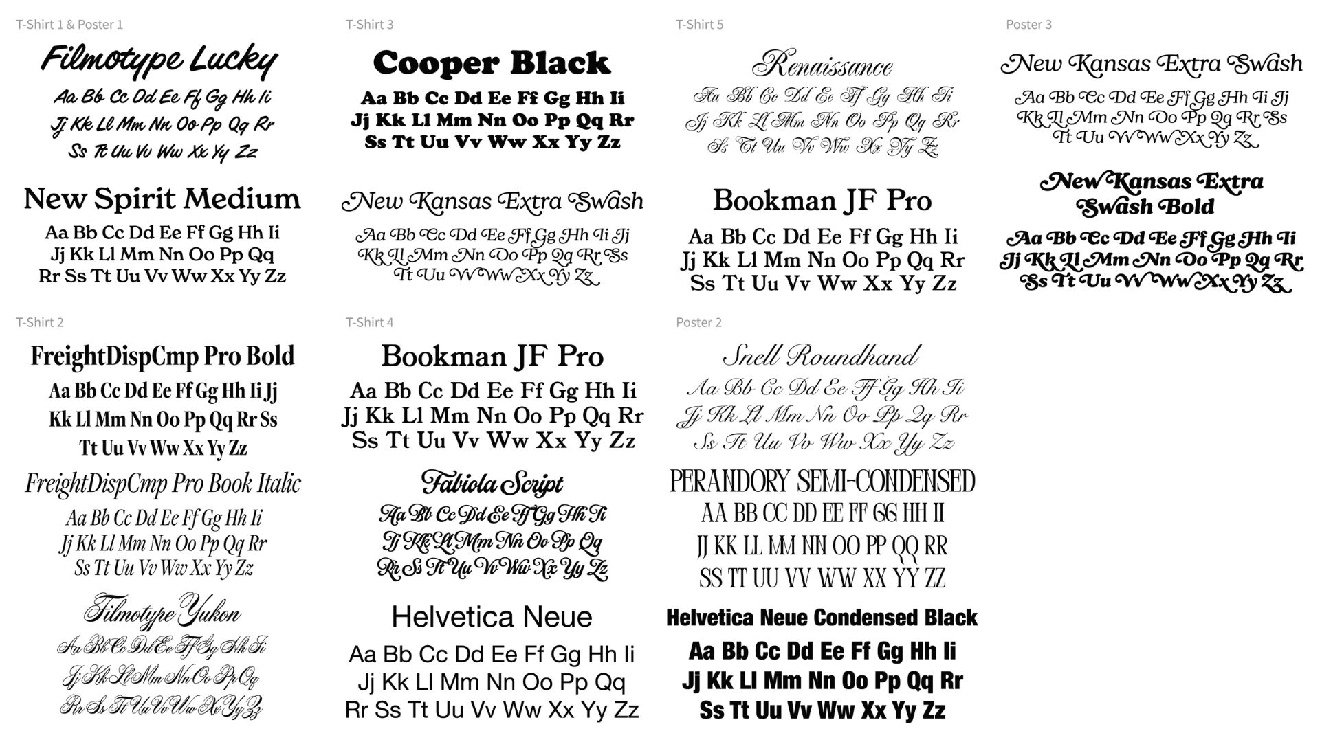
The final stage of this project focused on creating posters for the Heartwoods Mental Health Festival, taking visuals used in the t-shirt designs to keep everything consistent and recognizable. Key elements like the colors and graphics were carried over and rearranged to fit larger formats. The goal was to create posters that felt connected to the earlier pieces, offering something attention-grabbing that will draw people in. In this process we were able to experiment with more textures, and elements that couldn’t be translated on t-shirts. By reusing familiar design elements from earlier, the posters helped tie the whole project together and created a cohesive look to promote the event.
Management
Mark Franz
Project Manager
Nathaniel Berger
Account Manager
Creative Direction
Mark Franz
Creative Director
Caroline Murphy
Creative Director
Xenab Malik
Creative Director
Production
Amanda Baker
Lead Graphic Designer
Anthony Wotring
Assist Graphic Designer


