Community Food Initiatives
Task
Logo Design, Discovery and Research, Concept Development, Digital Drafting
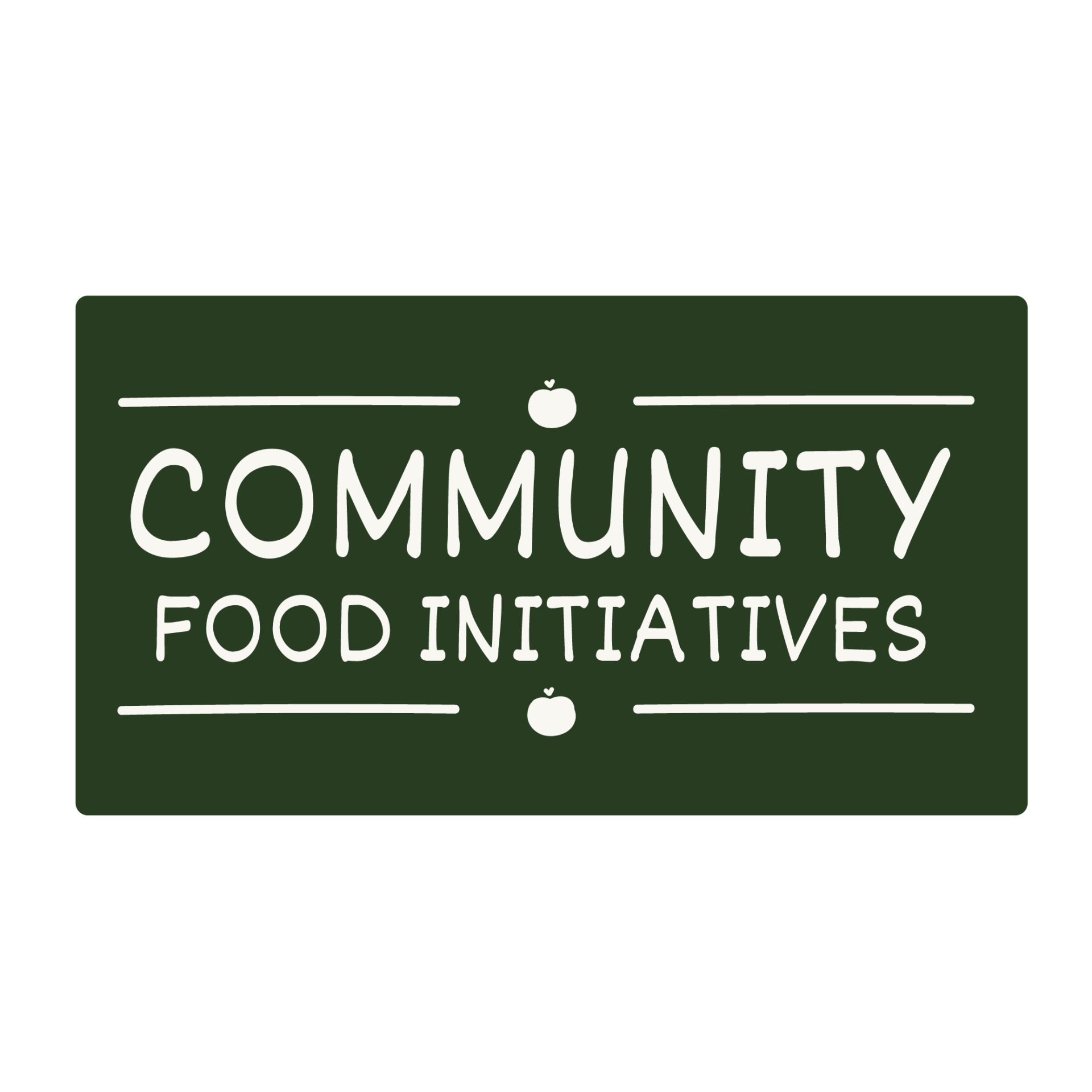
My client was very communicative throughout the design process and provided consistent feedback and thoughtful suggestions, which helped clarify her vision. She was engaged and open to exploring different directions, which I appreciated. However, one of the ongoing challenges was her difficulty in making final decisions. While she offered valuable input, her preferences changed frequently, and she has yet to finalize a logo design.
In addition to navigating shifting preferences, we also worked on integrating elements of her existing branding into the new logo, which added another layer of complexity. Striking a balance between refreshing the brand identity while maintaining consistency with what already existed required careful planning and creative problem-solving.
Accessibility was also a key consideration throughout the process. We spent a significant amount of time researching and testing fonts that would not only reflect her brand personality but also be easily readable and accessible to a broad audience. Choosing a color palette that met contrast and accessibility standards while still feeling visually cohesive with the existing branding was another challenge we faced.
Overall, the project required a great deal of adaptability, clear communication, and thoughtful design choices to move forward effectively.
We used digital illustration and hand lettering to create this organic design. The final bags will be printed and sewn by Rural Action, and distributed in OhioHealth cafeterias and food banks.
I examined the existing brand elements provided by the client and looked for ways to incorporate their established identity into the new logo design. A key goal was to stay true to their messaging while developing a visual that felt lush and aligned with their evolving needs. Throughout the iterative process, I created over 3 design variations, experimenting with layout, color, typography, and illustrations to strike a balance between visual appeal, accessibility, and brand consistency. This back-and-forth approach allowed for thoughtful refinement, even as the client continued to explore different directions and had difficulty making final decisions.
| Primary #F8F7F2 |
White |
◯ |
| R 248 G 247 B 242 |
Bean Sprout
| #657105 | Green |
◯ |
| R 101 G 113 B 5 |
Spinach
| #B5BC76 | Light Green |
◯ |
| R 181 G 188 B 118 |
Endive
| #283C21 | Dark Green |
◯ |
| R 40 G 60 B 33 |
Kale Leaf
| #FA9400 | Orange |
◯ |
| R 250 G 148 B 0 |
Turmeric
| #C2512F | Red |
◯ |
| R 194 G 81 B 47 |
Radicchio
Typeface
Dekko
Usage
Headlines
Typeface
The Serif
Usage
Subheadlines
In the final phase of the logo design process, I tested how the design would perform across different formats and sizes to ensure it remained clear and effective. Because accessibility was a priority, I paid close attention to color contrast and font readability, especially at smaller scales. Through testing, I realized that some adjustments were needed to improve legibility and reduce the loss of detail. This stage also helped identify how well the logo integrated with the client’s existing branding. After reviewing these refinements with the client — who continued to offer helpful feedback but had trouble making final decisions — I made thoughtful revisions to strengthen the overall clarity, accessibility, and flexibility of the design.
Management
Mark Franz
Project Manager
Nathaniel Berger
Account Manager
Creative Direction
Mark Franz
Creative Director
Caroline Murphy
Creative Director
Xenab Malik
Creative Director
Production
Courtney Schimpf
Graphic Designer
Briele Dudgeon
Graphic Designer


