The Dairy Barn
Task
Create merchandise designs for a international quilt show

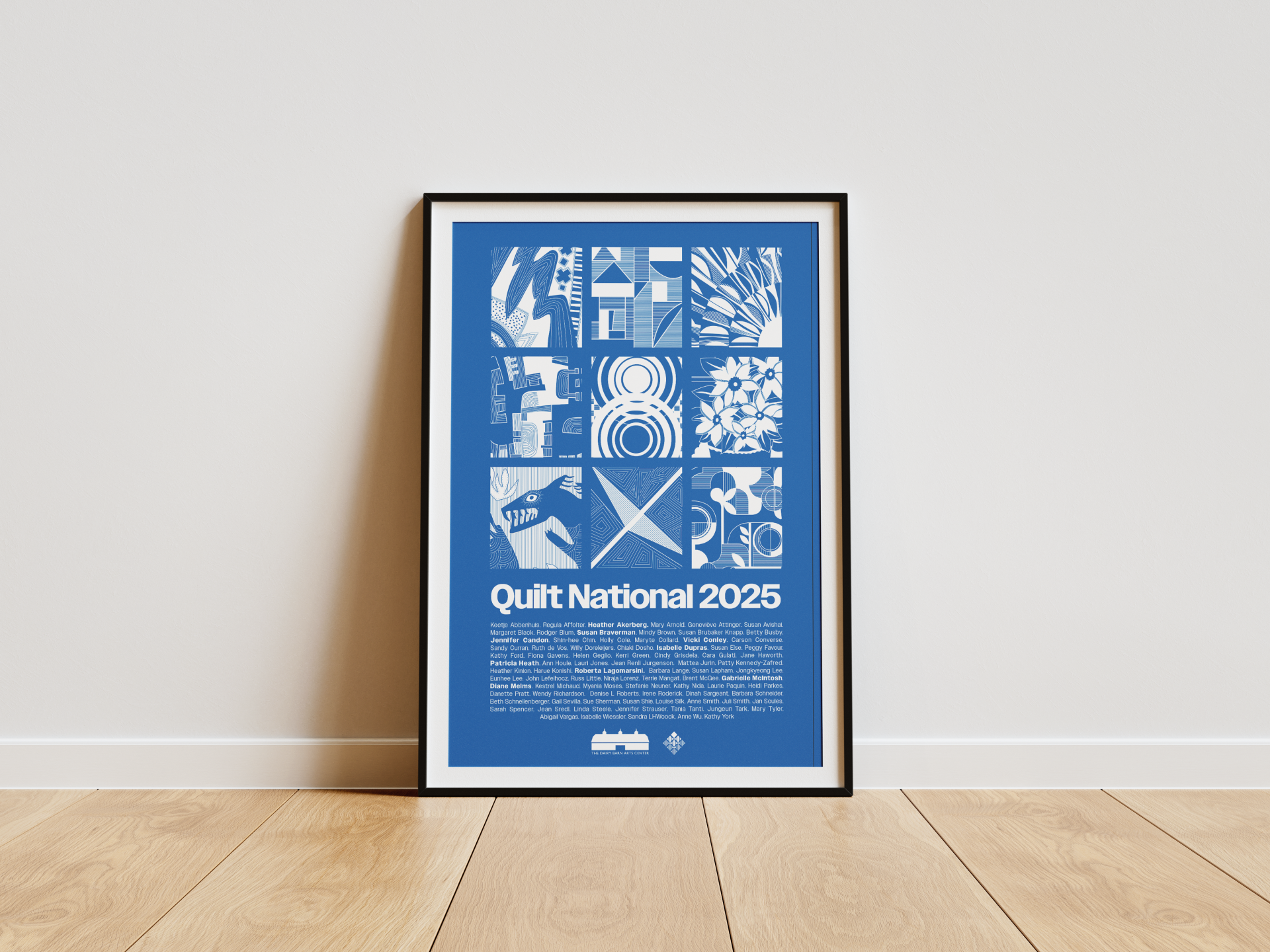
The main challenge faced in this project was creating a design that reflected the varied nature of the works displayed in the Quilt National exhibition. When thinking of a quilt show, people often imagine traditional geometric patterns. However, Quilt National showcases the best in contemporary quilt-making, pushing the boundaries of tradition while celebrating creativity, technical mastery, and artistic expression. The quilts in this show are dynamic, diverse, and inventive, and our design needed to reflect that. While designing, we also took into consideration what the artists may want to see. We needed to create a design that would have a broad appeal to those in the show, but also outsiders.
The deliverables for this project included one main piece of artwork that could be adapted to fit a t-shirt, a canvas tote bag, and a poster.
We used digital illustration to create the quilt-inspired artwork blocks. We then used Adobe Illustrator to layout the text for each design variation. The final designs will be screen printed and sold at the Quilt National 2025 exhibition.
In our initial meeting, the clients expressed that they wanted to explore designs that captured the spirit of the Quilt National show, along with The Dairy Barn itself. Based on this, our team developed three design concepts to present to the clients. The images below show these early concepts. We presented a clean, grid based design featuring illustrations of the quilts in the show,
a map based design which would utilize textures of the quilts while highlighting the location of the Dairy Barn, and a design that featured that unique Dairy Barn building that the exhibition is held in. The client chose to move forward with the first concept.


Primary #1469b0 |
SCSS var $color-blue |
◯ |
R 20 G 105 B 176 |
Dairy Barn Blue
Navy #002c55 |
SCSS var $color-navy |
◯ |
R 0 G 44 B 85 |
Dairy Barn Navy
Light Blue #9BC6DD |
SCSS var $color-light |
◯ |
R 155 G 198 B 221 |
Dairy Barn Light Blue
White #FFFFFF |
SCSS var $color-white |
◯ |
R 255 G 255 B 255 |
White

The final step in this process was optimizing each iteration of the design for their respective printing methods. The original artwork was highly detailed in order to capture the intricacies of the quilts, however not all of this could be captured through certain print processes, such as screen printing. Because of this, the t-shirt artwork needed to be adapted to have bolder line work and more contrast in order to maintain the legibility of the design after printing.


Management
Mark Franz
Project Manager
Nathaniel Berger
Account Manager
Creative Direction
Mark Franz
Creative Director
Caroline Murphy
Creative Director
Xenab Malik
Creative Director
Production
Kylie Colwell
Graphic Design
Courtney Schimpf
Graphic Design