Tend Space Art Center
⬤ 01. Challenges
Design Challenges
One of the biggest challenges in this project was creating a visual identity that felt experimental, community driven, and energetic while still respecting the core mission of Tend Space. As a new arts focused organization, they needed a system that felt expressive and contemporary yet approachable to a wide audience. We had to find the balance between playful creativity and a structure that could grow into a full brand ecosystem.
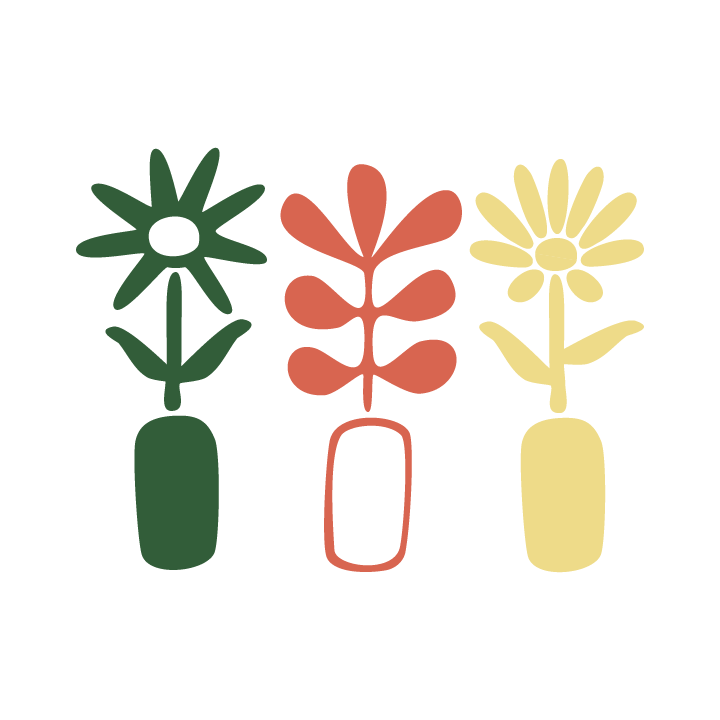
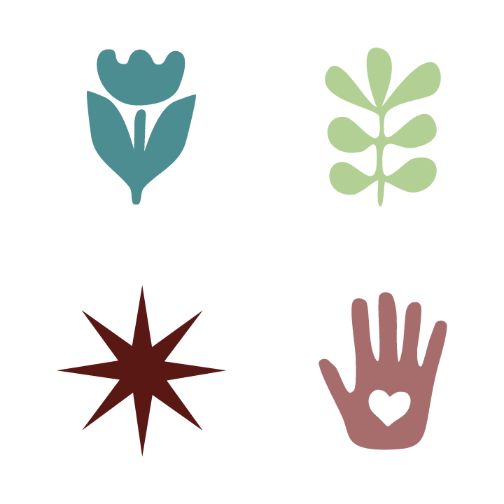
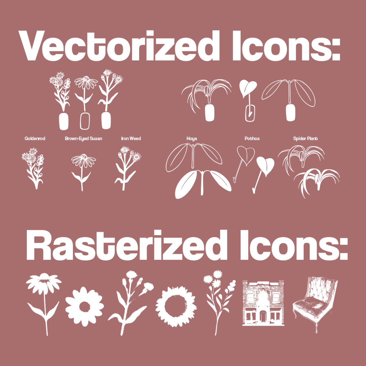
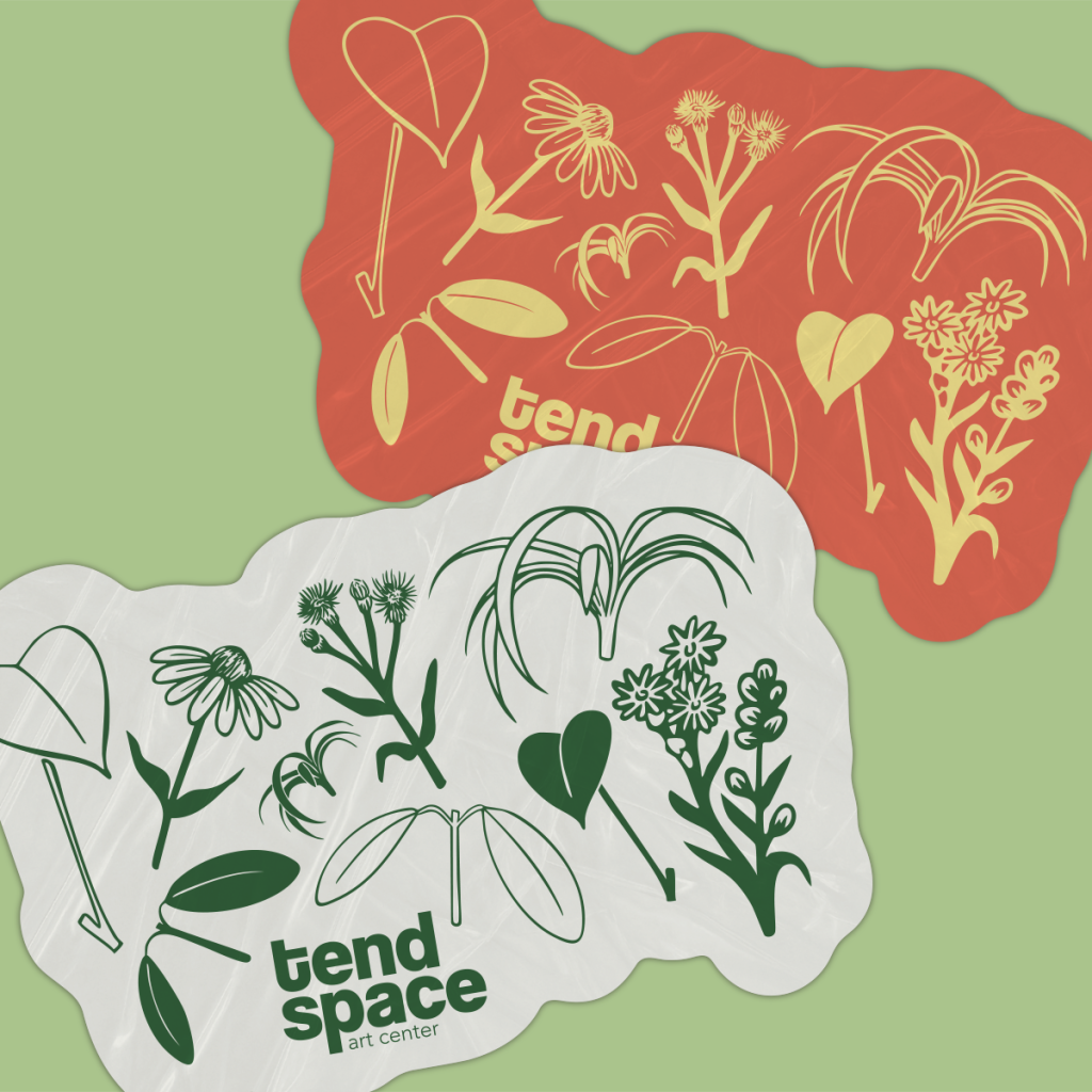
Another challenge came from developing a consistent illustration and icon style that communicated their focus on native plants, growth, and creative exploration. Since these assets would appear across a wide range of mediums from small stickers to large environmental graphics, every element needed to stay clear, recognizable, and flexible. This meant simplifying plant forms, adjusting line weights, and testing how the icons worked at very different sizes and in both print and digital formats.
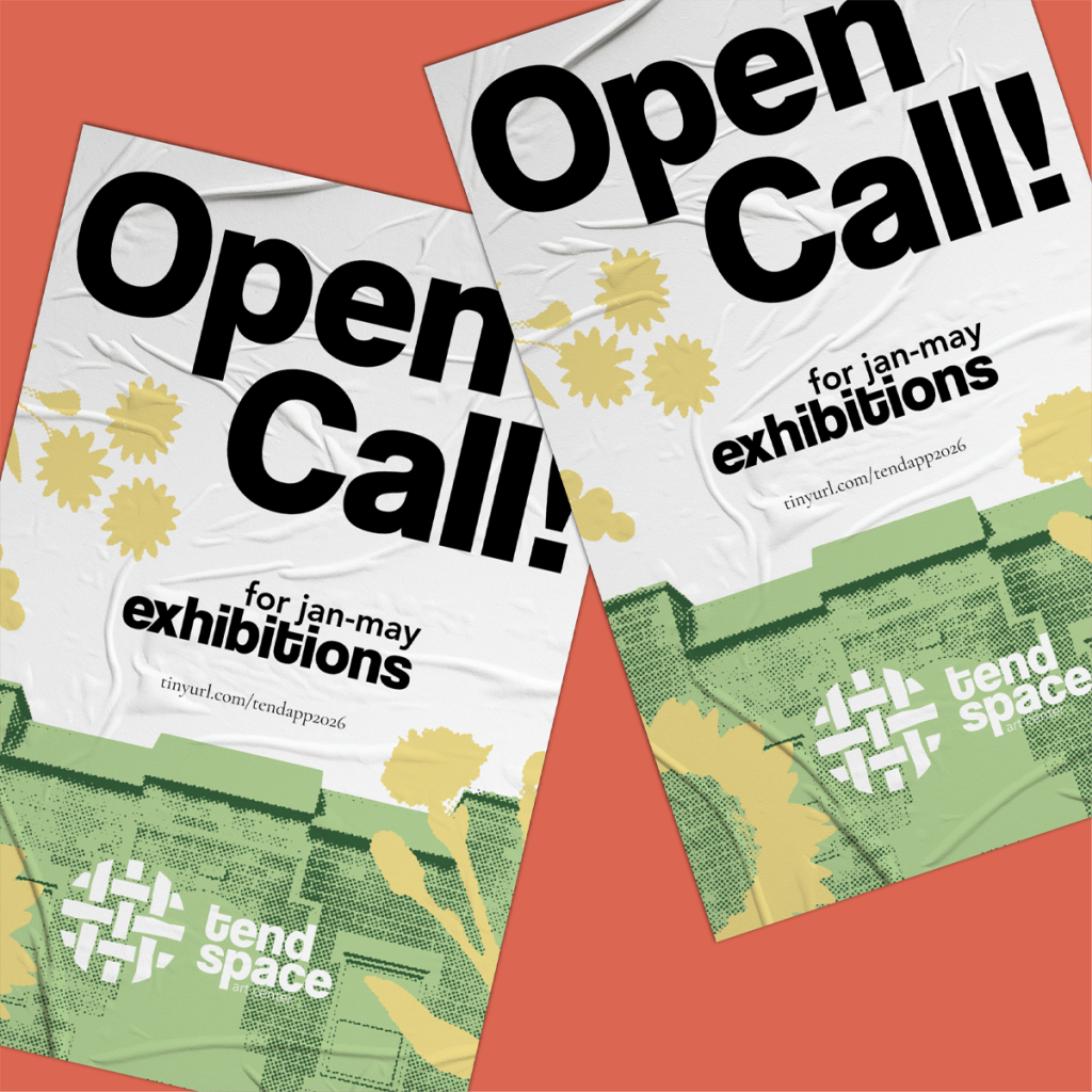
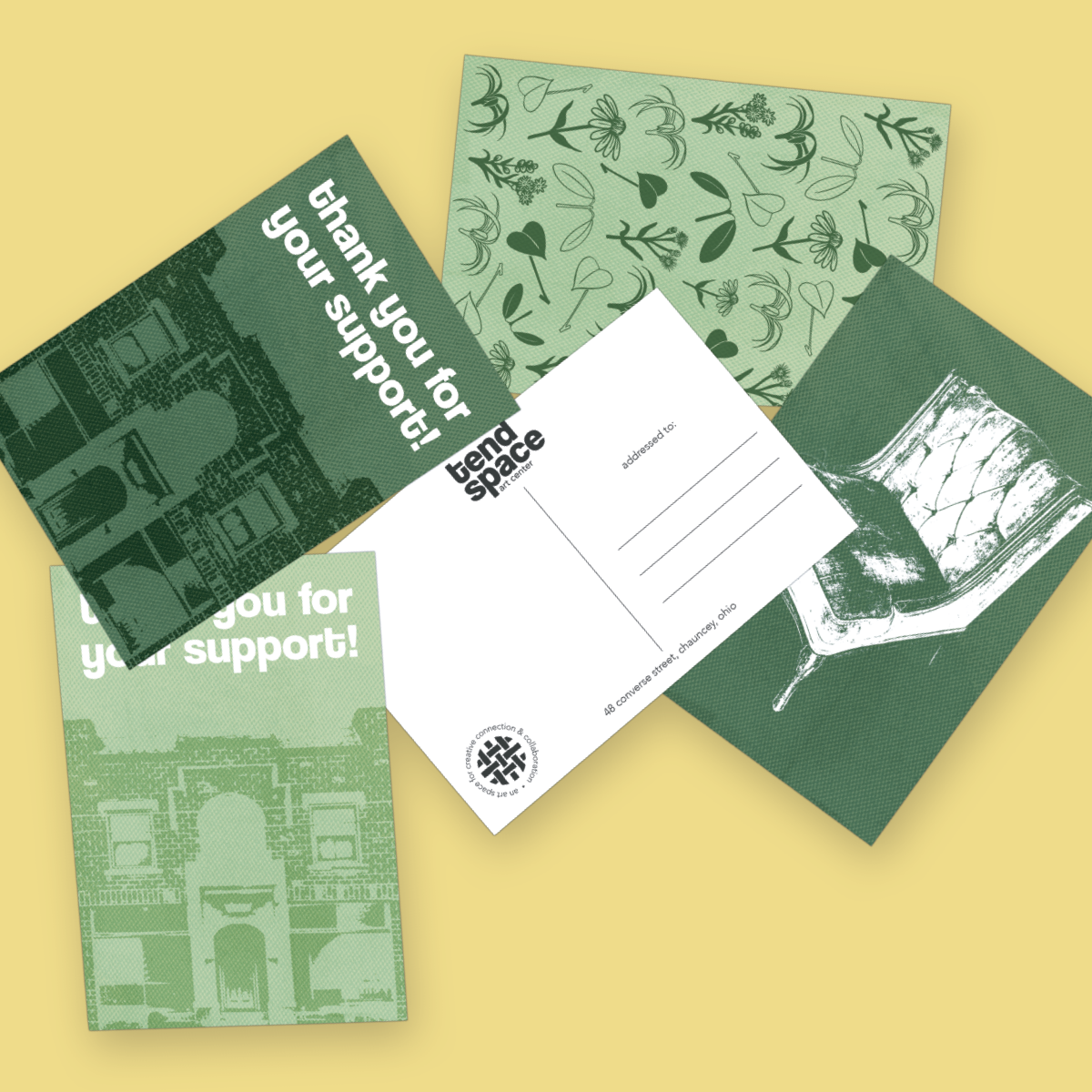
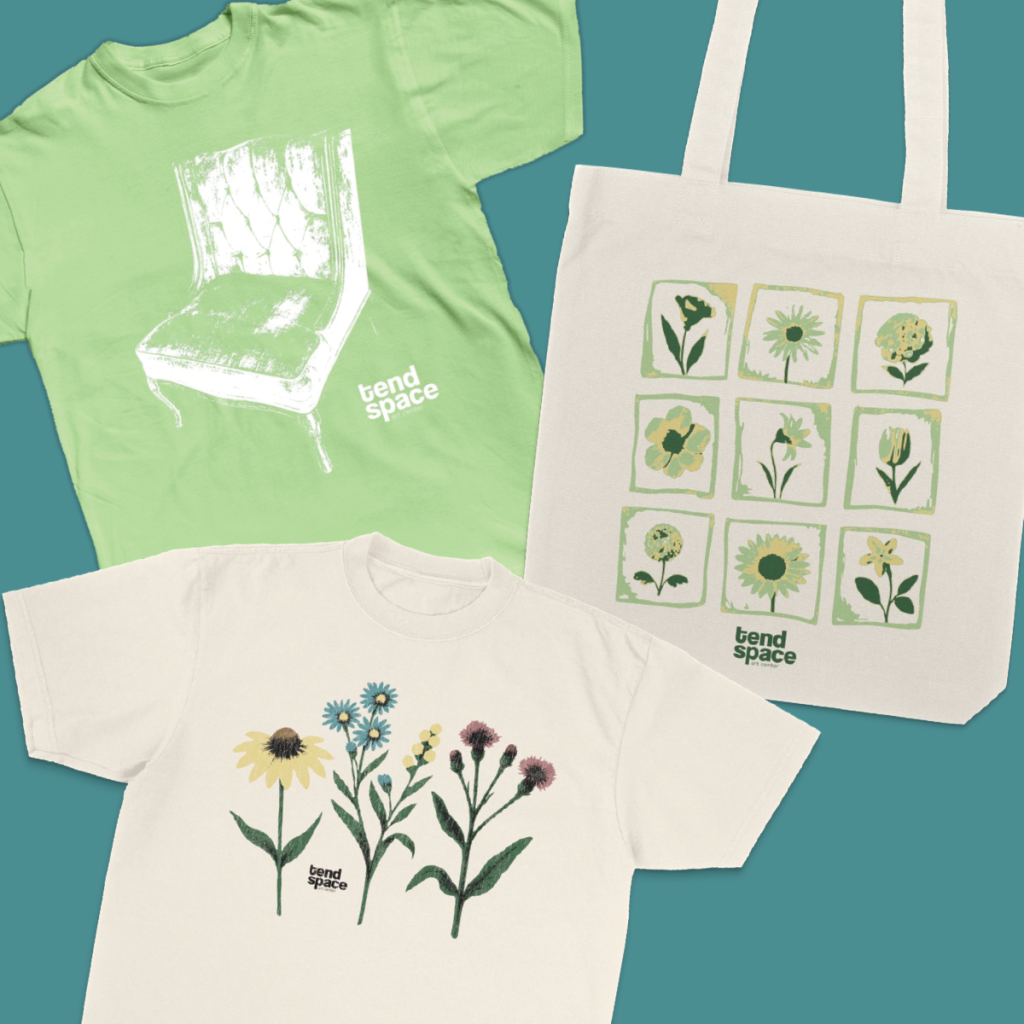
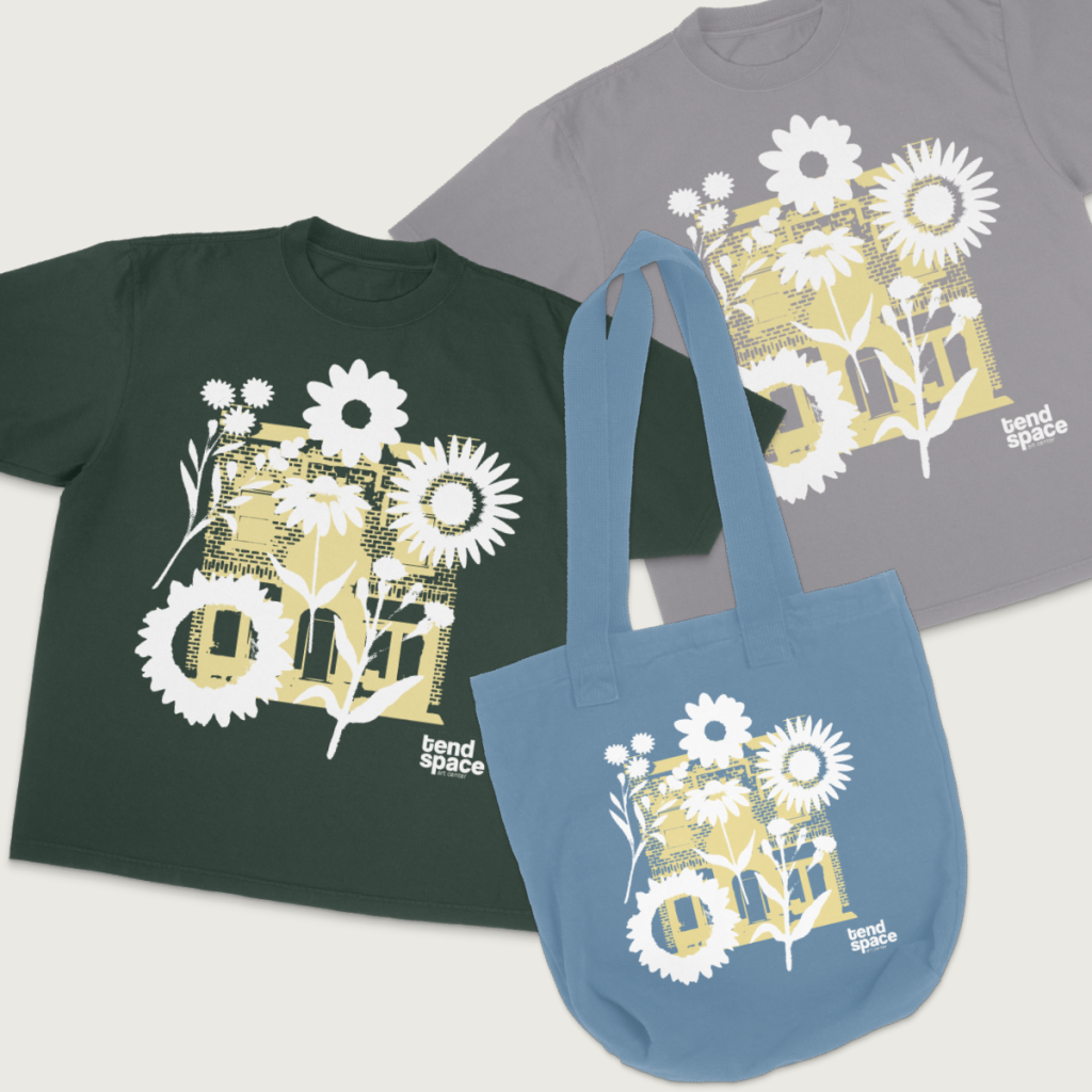
The final deliverables for this project included a complete logo system with primary and secondary marks, a custom icon family inspired by native Ohio plant life, a flexible color palette, and typography guidelines. Along with the core brand system, we created merchandise designs, sticker sets, postcard designs, and detailed mockups to help the client visualize how the work would appear in real world use. All of these pieces came together in a cohesive brand guideline document that gives Tend Space a clear and useful foundation as they grow their presence and build community through the arts.
⬤ 02. Experience
Exploring creativity while building a clear visual system
We set out to create a visual system that could represent the energy and curiosity at the heart of Tend Space. This meant experimenting with illustration styles, plant motifs, logo structures, textures, and color directions to see how each contributed to the overall feeling of the brand. Our goal was to keep the artwork expressive and engaging while ensuring it could scale across real world applications.
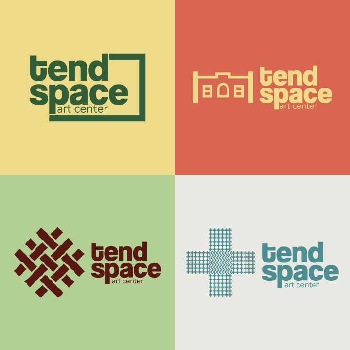
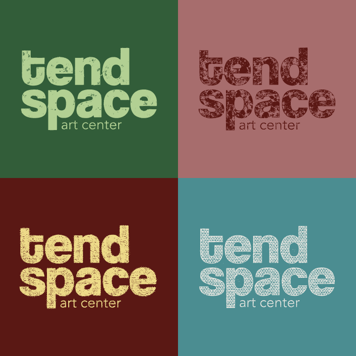
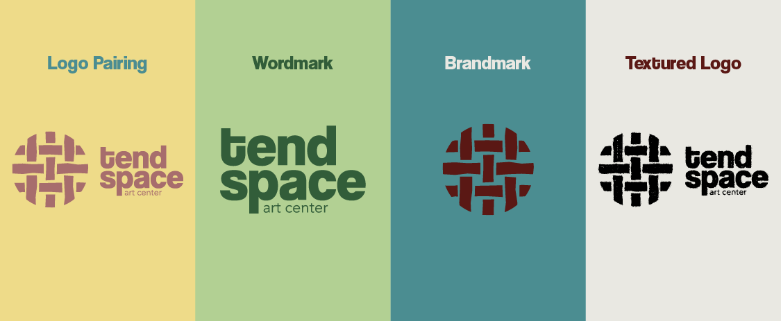
The images below show a selection of the logo variations and icon styles that were explored during the development phase. These early concepts helped define the visual character of the brand and guided the direction toward a system that feels grounded, imaginative, and true to the mission of Tend Space.
Color palette
Deep Green
#335d39
SCSS var
$color-deep-green
R 51
G 93
B 57
Muted Rose
#a86e6e
SCSS var
$color-muted-rose
R 168
G 110
B 110
Light Olive
#b3d195
SCSS var
$color-light-olive
R 179
G 209
B 149
Coral Red
#d96551
SCSS var
$color-coral-red
R 217
G 101
B 81
Warm Sand
#efdc8a
SCSS var
$color-warm-sand
R 239
G 220
B 138
Deep Brick
#5a1815
SCSS var
$color-deep-brick
R 90
G 24
B 21
Soft Stone
#eae9e3
SCSS var
$color-soft-stone
R 234
G 233
B 227
Teal Mist
#4b8e92
SCSS var
$color-teal-mist
R 75
G 142
B 146
Typography
Typeface
Coolvetica
Usage
Headlines
Typeface
Avenir
Usage
Subheadlines
Typeface
Cormorant Garamond
Usage
Body
⬤ 03. Process
Deciding and providing
The final stage of this project focused on refining and selecting all of the completed brand elements. This included reviewing the full range of logo variations and icon concepts, then determining which versions best represented the direction of the brand. We also finalized the designs for shirts, stickers, postcards, and other merchandise items, along with their accompanying mockups to show how each piece would appear in real use. Once all decisions were made, the complete set of finalized files was organized and delivered to the client to ensure a smooth handoff and a ready to use brand system.
Credits
Management
Mark Franz
Project Manager
Nathaniel Berger
Account Manager
Creative Direction
Mark Franz
Creative Director
Caroline Murphy
Creative Director
Xenab Malik
Creative Director
Production
Anthony Wotring
Head Designer
Amanda Baker
Assistant Designer