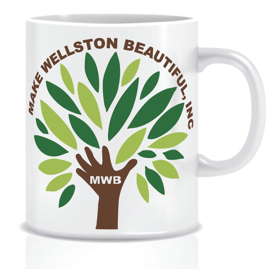
In this project it was mainly on creating a brand new logo for the client. They had outgrown their old logo. They had concerns that their logo was too similar to all the others. The Client knew they wanted a tree as their logo. I did research and came up with some options.
We went through some color changes and placing different text in different locations. Some challenges ran into was having the space between the leaves and the hand. I had worried about the readability issues if the text was changed to a different color. Also some other problems I had was placing the leaves in just so that it looks like a tree and getting rid of the extras. It was cleaning up the minor issues. I also made the the lettering in the hand cutout so that whatever it will be placed on it will be transparent onto the hand.
This logo can be placed on different objects and different places for the company.