Ironton in Bloom

Task

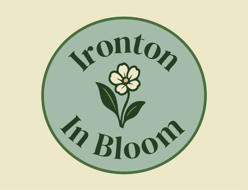
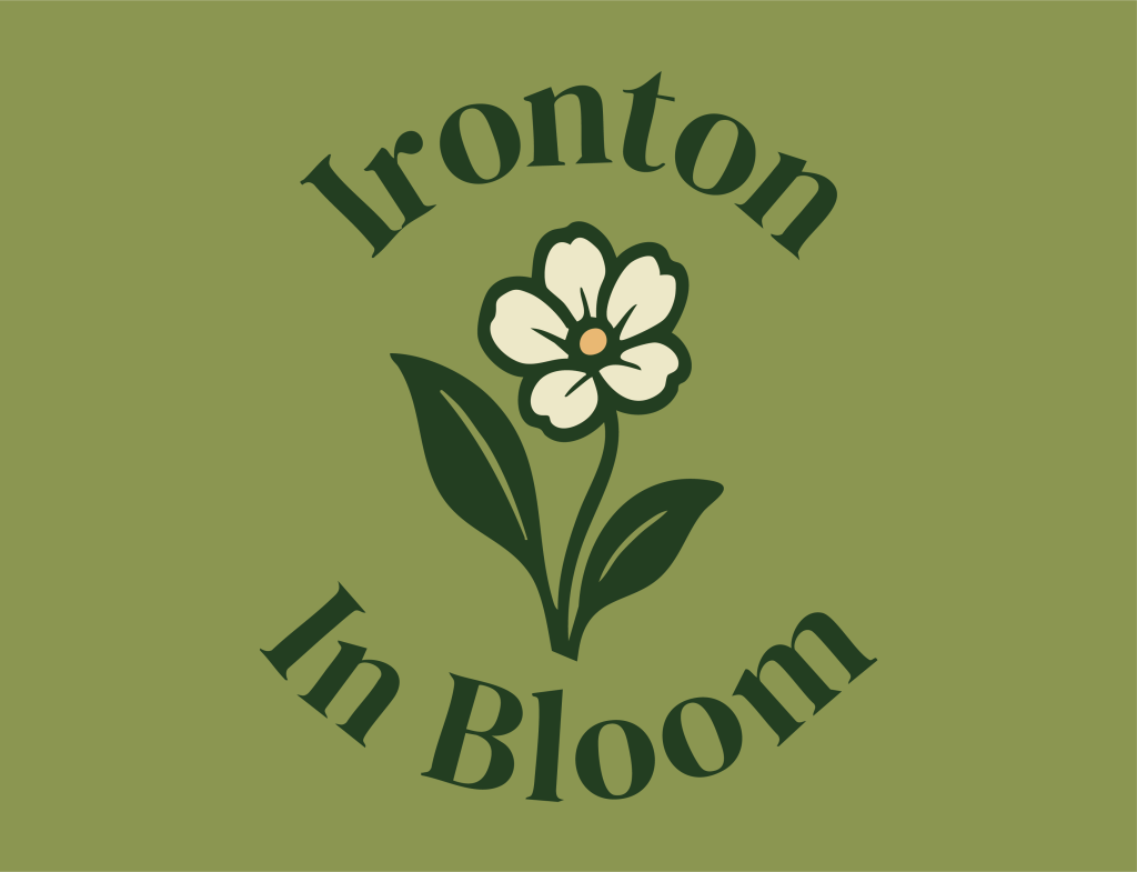
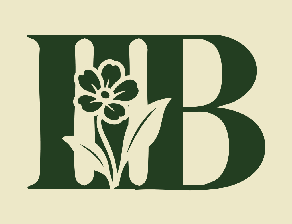
The task of this project was creating a new logo for Ironton in Bloom and from there, developing a brand.
  • Strategy

    Brand Strategy

  • Design

    Branding and Logo Design

  • Client

    Ironton in Bloom

⬤ 01. Challenges

Design Challenges

The largest challenges within this project was trying to balance the different opinions and wants of a group of people rather than a singular client. With a brand run by a committee that voted on things, it could be difficult to incorporate the different aspects wanted while still staying true to the core principles and values the brand had already given us.

The second challenge was taking an existing brand and refreshing it to both maintain the original audience while also expanding it to a broader category of people. When working on branding, knowing the demographic is essential to the process in order to make sure the design is appealing to the target. When you expand the target market and encompass multiple different demographics that can be vastly different in terms of taste and interests, it was slightly difficult to strike the balance between those groups.

⬤ 02. Experience

Balancing fun, professionalism, and readability

The experience of this process could be at times complicated due to the nature of the task. However, we were able to work not only on design skills but skills within client communication, scheduling and deadlines, as well as how to properly address feedback as we went through the design stages.

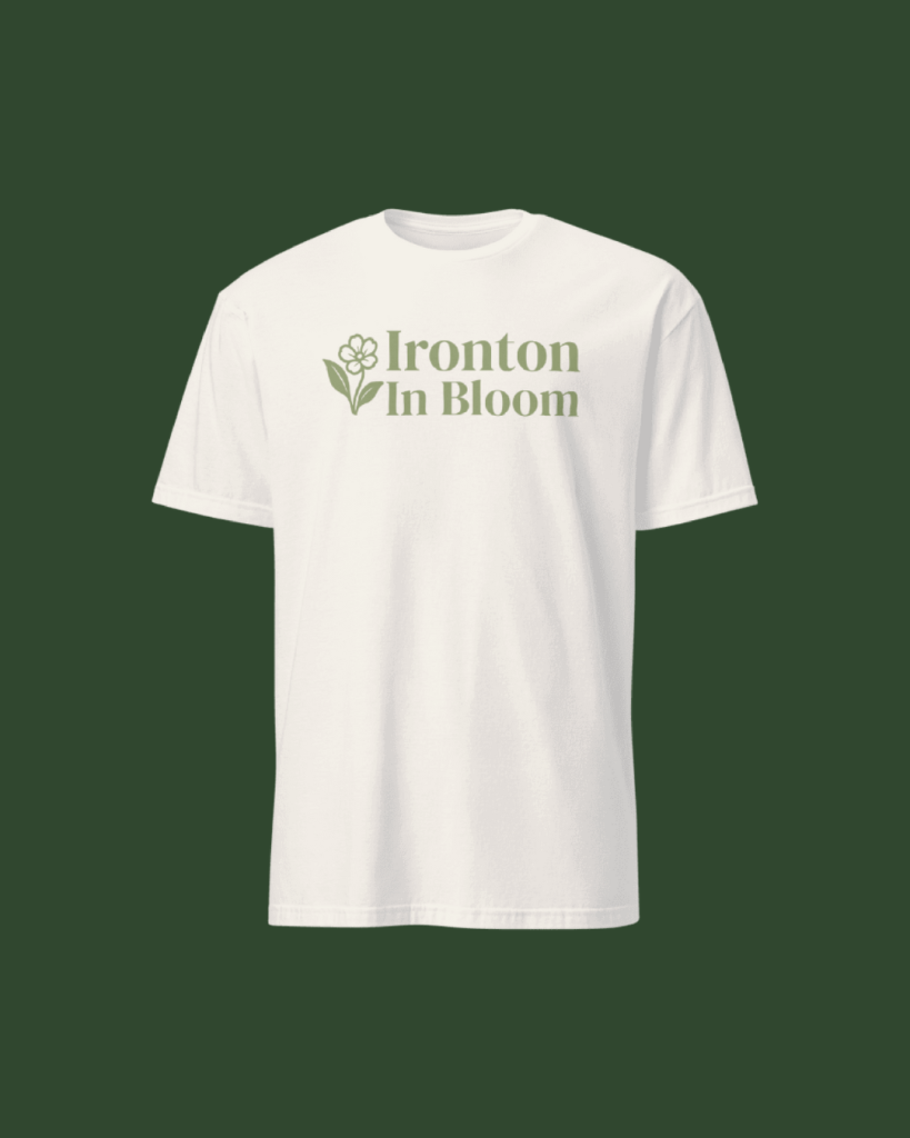
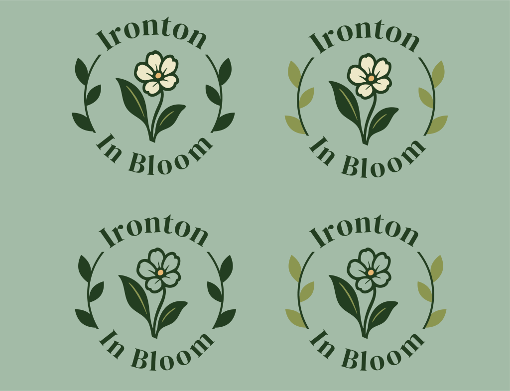
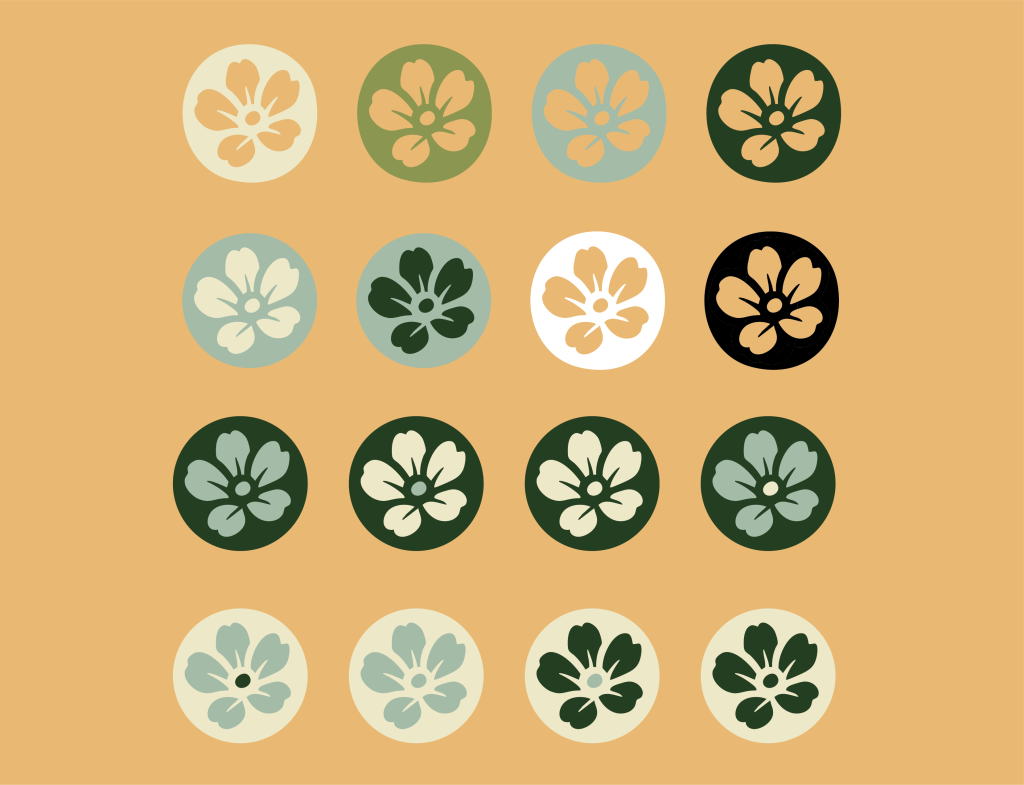
Over 15 different designs as well as dozens of color variations were produced for secondary logos and branding markers as seen below.

Color palette

/ Foundations

Secondary
#243e22
SCSS var
$color-green

R 36
G 62
B 34

Ironton Evergreen

Primary
#8a954f
SCSS var
$color-green

R 138
G 149
B 79

Ironton Sage Green

Secondary
#a3bba8
SCSS var
$color-blue

R 163
G 187
B 168

River Blue

Secondary
#ece6c7
SCSS var
$color-cream

R 236
G 230
B 199


Cream

Accent
#e8b873
SCSS var
$color-orange

R 232
G 184
B 115

Pale Orange

Typography

⬤ 03. Process

Testing and finalizing

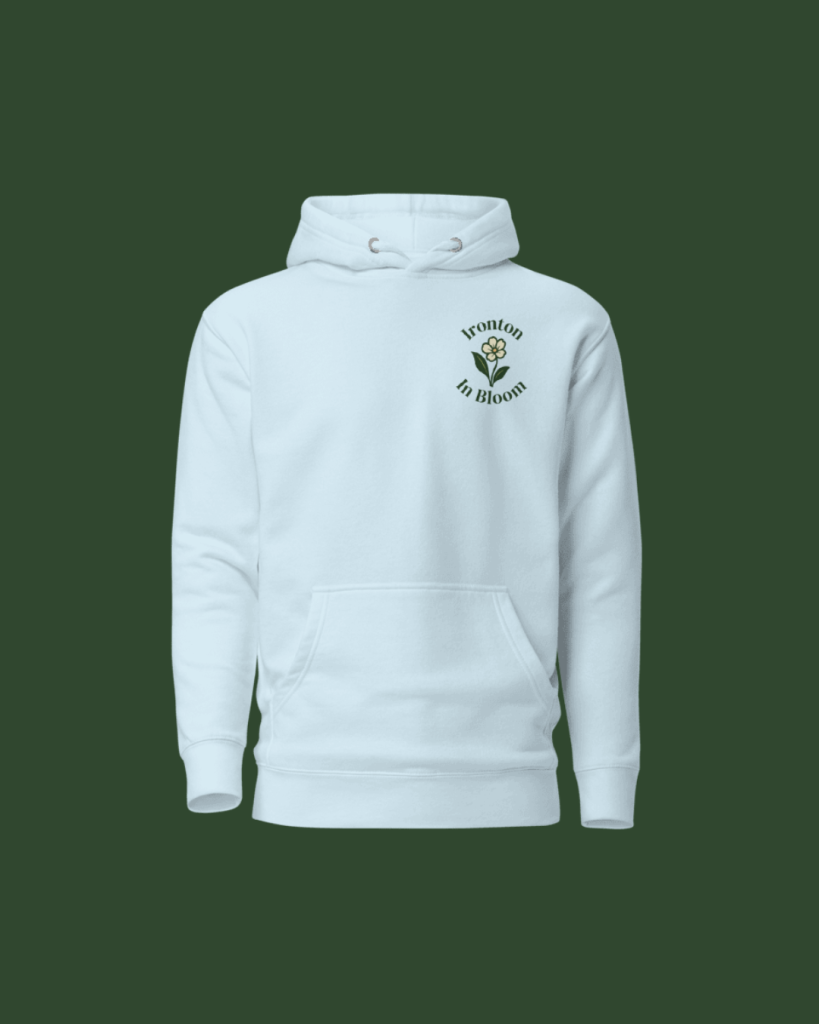
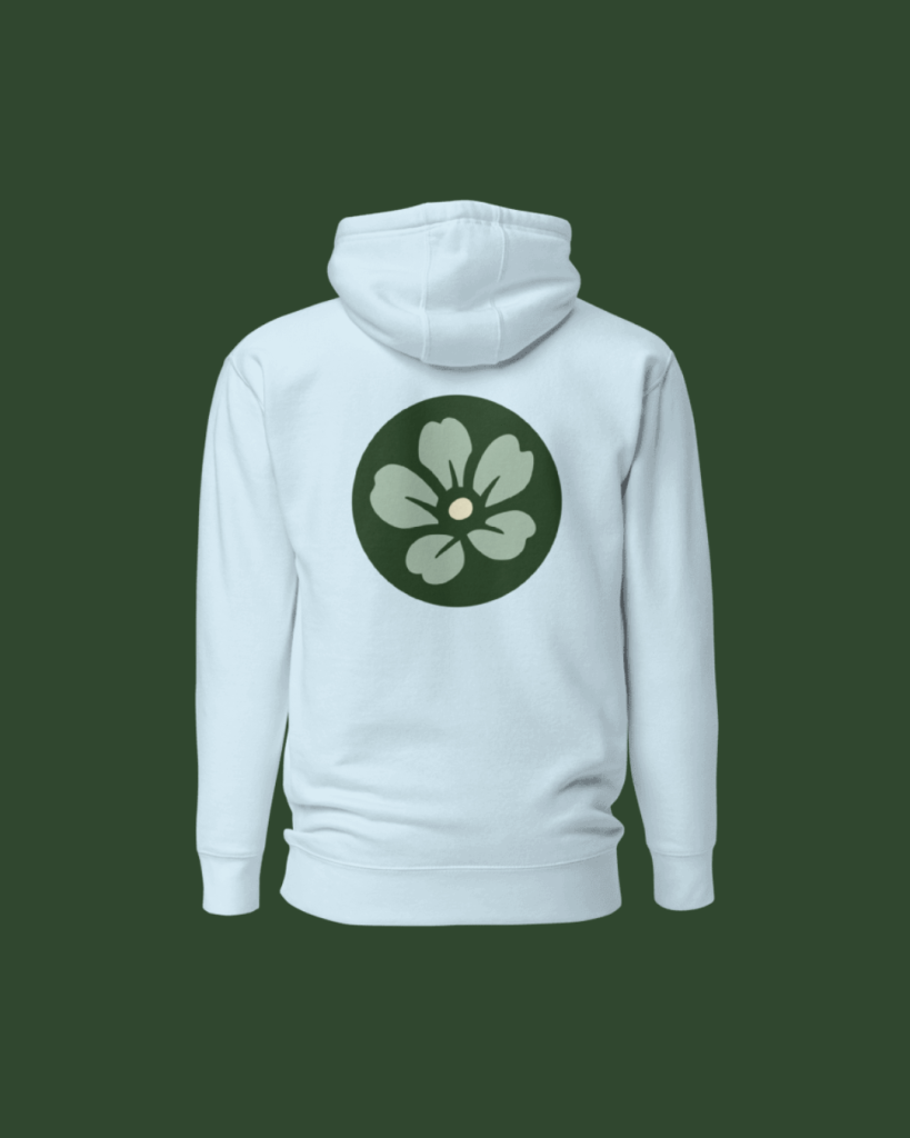
We took a look at a vast range of existing logos for inspiration and continuously experimented with different colors, typography, and art styles in order to find the niche where Ironton belonged. We continued to take client feedback into consideration while also searching for different potential resources to help bring the vision to life. The last stage of the process was taking out logos and mocking them up onto not only merchandise, but letterheads and a variety of signage to help the client not only see what everything would look like when printed out but help them visualize the different ways things could be used.

Credits

Management

Mark Franz
Project Manager

Nathaniel Berger
Account Manager

Creative Direction

Mark Franz
Creative Director

Caroline Murphy
Creative Director

Xenab Malik
Creative Director

Production

Nevada Fish
Graphic Design

Jalynn Eberts
Graphic Design

Ready to work together? Propose a project through our organizing partner, the Impact Enterprise Team.

Oh You! Design Agency: An Ohio University College of Fine Arts & Voinovich School of Leadership & Public Service Partnership.
Back

This website stores cookies on your computer. Cookie Policy